Archive
Chrome’s sound indicator – a welcomed innovation for lessening embarrasment

I sat at my desk early in the morning while the office was mostly empty. A coworker arrived, said hello and sat down to work. She put on her headphones and started blasting music. The only problem? Her headphones were unplugged and the music was playing for the whole office to hear.
Accidental noise like this is very embarrassing. I welcome all innovations that make this less likely to occur. I was blown away when I used an iPod for the first time and unplugged the headphones. Unlike the CD players I had used before, the music paused. With the iPod it didn’t make sense to continue to play music without the headphones plugged in, since there was no internal speaker.
I am happy that both iPhone and Android adopted this convention as well. You’re much less likely to embarrass yourself if the sound stops as soon as headphones are removed rather than automatically switching over to the external speakers. I wish that laptops did the same, but alas.
I live most of my work day in a browser. I often end up with a whole slew of tabs. Suddenly I hear some sort of noise – one of the dozen pages I have open is blaring an ad. I usually have to search each tab one by one to try to find the culprit. Chrome recently launched a new feature to visually distinguish which tab is making noise. This is a brilliant innovation, and one I welcome in my quest not to make a fool out of myself in front of others.
Disclaimer: I work at Google. The opinions expressed are my own and do not represent that of my employer.
OpenTable’s Violation of the Principle of Least Astonishment
I was taking an OpenTable survey about a recent dining experience, when I noticed a poor piece of user interface design.

The last question asks about the noise of the restaurant.

Quiet – reasonable first choice.

Moderate – yup, still with you.

Energetic! Yes. What could be louder than energetic?

Do not recall.
This is a rather strange (and bad) choice for an option, as it doesn’t follow the convention of the other controls on the page (or that I’ve ever seen on any survey ever). I would wager that more than half of the entries in their database they get for the “Do not recall” entry were intended to be “extremely loud” but the survey participant didn’t even stop to see the text change but instead assumed that the largest value would correspond with the loudest entry.
This design is a clear violation of the Principle of Least Astonishment, since it violates the strong convention that on a survey, lower is to the left and higher is to the right. Furthermore, a ‘do not recall’ answer should either be inferred from not answering the question, or by an alternate control (e.g. a checkbox) that would disable the control with the noise level readings.
Slips vs mistakes – what WordPress gets wrong that Blogger and Tumblr get right
You’ve just finished a blog post and are in the process of scheduling it to go out at a certain time to maximize exposure. You click the confirmation button, only to see your post go live immediately rather than the time you scheduled.
Oops. What went wrong? This happened to me once (and nearly multiple times) due to poor UI design on WordPress.com. Fortunately I only lost a few potential page views; in other cases early releases of information have cost businesses dearly.
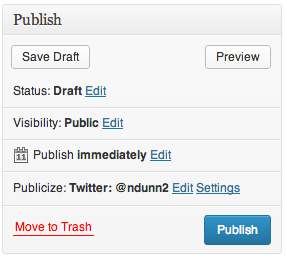
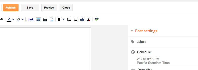
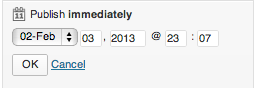
Scheduling a post
Here is the dialog for publishing on WordPress.
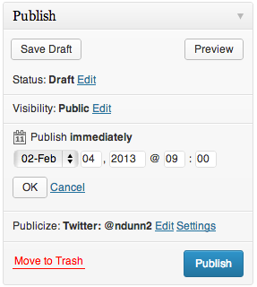
If we click Edit, UI elements reveal themselves for choosing a date and time at which to publish the post.
It was at this point where I pressed the Publish button and my post went live immediately. Do you see what I did wrong?
Slips vs mistakes
From my time in Scott Klemmer’s Human-Computer Interaction (HCI) course, I learned that errors can divided into two classes – slips and mistakes.
A slip is when the user has the correct mental model of the interaction yet makes an error on accident. For instance, if two buttons are close together and you click one rather than the other on accident, that would be a slip. These can often be addressed through things such as making touch targets bigger and adding separation between buttons. From the screenshot, you can see that the Publish button is very large and there’s nothing next to it to accidentally press. (The decision to have the Move to trash button on the same row is rather strange, but it is sufficiently far away that I did not accidentally click on it). This is not the type of error I made.
A mistake stems from the user having the incorrect mental model. That is precisely what happened to me. I did not accidentally press the Publish button; I intentionally pressed it but I had the wrong idea to what would happen. Let’s investigate why.
Convention
What makes interfaces intuitive? Part of it comes from adhering to convention and following the Principle of Least Astonishment. The Wikipedia article sums it up nicely:
In more practical terms, the principle aims to exploit users’ pre-existing knowledge as a way to minimize the learning curve for instance by designing interfaces borrowing heavily from “functionally similar or analogous programs with which your users are likely to be familiar.”
This publishing widget violates conventions in a few ways.
Discarding unsaved user input without warning.
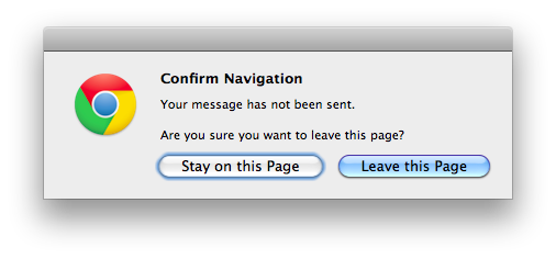
Many programs will warn if you’re about to do something destructive to unsaved input. For instance, if you are half way through a message in Gmail and attempt to close the tab or browser, you will see the popup warning:
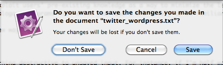
Similarly, all Cocoa applications on Macs will clearly show unsaved state and warn if you try to close a program without saving:

If there are form elements whose state is about to be destroyed by an action, it would make sense to issue a warning about that. This WordPress form does not do the user that courtesy.
Too much state
Most programmers understand that there is state saved on both the server and client. The client will fetch the data from the server and adjust its UI controls to match. Changes to the UI controls don’t automatically get sent to the server; generally there’s some final OK/Cancel action to either accept or discard the changes. Normal users should not need to know this – it should just work. This control exposes too much information unnecessarily. Why would one care what the current server side state is vs what’s in the UI control for each individual section? Why wouldn’t she just set the options the way she likes and hit one button to apply all of the changes?
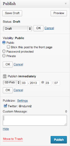
Even if she understands the distinction between client side and server side state (like I do), it is an extremely unfamiliar interface to have to hit OK on a subsection of a form before finally submitting it. I cannot think of one other example that does this. It is convention that hitting the big Confirm button at the end of a form will use whatever information is currently in the form.
In addition to not expecting to have to hit another OK button in order to have my changes applied, this form suffers an additional problem – there is too little contrast between the OK button and the form. Note how the OK button all but disappears with the least amount of blur:

The eye is naturally drawn towards the big blue button in the lower right, which is exactly what I clicked on.
If I had pressed OK, then the Publish button would have changed its text to “Schedule.” Without knowing that that change would occur, I assumed that this control behaved like all others I had used before and so made the mistake.
Alternatives
Let’s look at alternative blogging sites and see how they do things better.
Blogger
Blogger separates the configuration of the publishing options from the publish button itself.
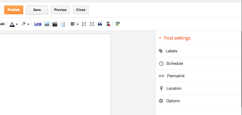
Once you click on the Schedule button, the Schedule section expands. Note that only one section can be expanded at once, unlike the WordPress widget.
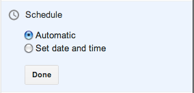
The “Automatic” option really means Now, which should be phrased more clearly. Clicking on the “Set date and time” option brings up a date picker:
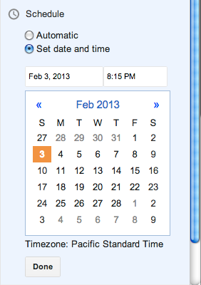
The setting is immediately applied if you click Publish, regardless of whether you have hit Done or not. If you do hit Done, the state is saved and the Scheduling section is collapsed.
There is no Cancel option – if you don’t want to change the date, just put it back to what it was before.
This approach works well. My one complaint is that the Publish text does not change to something akin to Schedule when a date is selected. I had to use trial and error to see what would happen on clicking Publish when a date had been chosen but before the Done button had been pressed – would it publish immediately like WordPress or would it respect the date options? Fortunately it does the most sensible thing and treats the state of the UI controls as the source of truth.
Tumblr
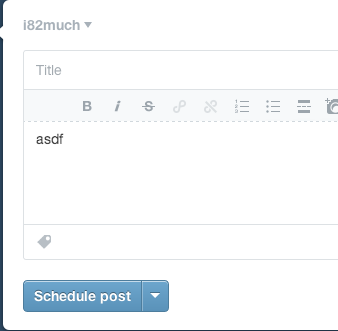
Tumblr takes an approach similar to WordPress but executes it much better. They optimize for the case of immediate publishing, hiding most of the options behind a disclosure button:
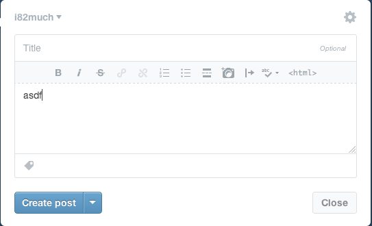
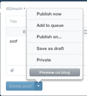
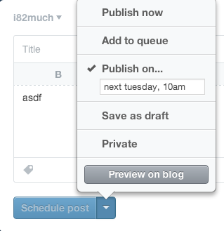
When you click the “Publish on…” menu item, a few things happen. First, there’s a check box next to the item, indicating unequivocally that this is the current selected option. Contrast this with WordPress, which has the confusing case of showing two states in the same area:
Next, notice that the text of the action button immediately changes from “Create post” to “Schedule post”, further cementing the fact that the post will not be immediately created. Finally, note that the button is grayed out and disabled – it cannot be clicked until the menu is dismissed and the changes are implicitly accepted. Once the menu is dismissed, the button is enabled.
This does everything correctly. It optimizes for the most common use case while hiding complexity. It uses bold visual cues to explain the state of the system. It follows conventions and makes it much less likely that the user will make a Mistake – the mental model of the user is much less likely to be at odds with that of the designer.
Conclusion
Understanding the mental model of the user is crucial for user interface designers. The WordPress designers have chosen to expose strange implementation details which make the act of scheduling a future post extremely confusing and error prone. For each option that can be modified, there is a saved state and the current UI state. Each section must be explicitly saved with ‘OK’ in order for changes to take effect. This leads to confusion in the UI because there is contradictory information being shown – on the one hand dates have been chosen but on the other text says ‘Publish Immediately’. If that isn’t confusing enough, the use of OK/Cancel within subsections of a form is not a standard design pattern. Finally, the OK/Cancel options are small and low contrast and thus are less likely to be seen.
I have shown how Blogger and Tumblr address the task of scheduling posts in two different but superior ways to WordPress. Blogger separates the Publish action from the configuration of scheduling, while at the same time making the current state of those settings take place immediately without explicitly confirming the selection. Because of this simplicity, there is no need for cancel or undo button. Tumblr hides the scheduling details behind a button but makes it absolutely clear through both a large checkbox and an immediate change in button text what will happen when you click it.
The general principles to take away from this case study are:
- Keep things simple
- Follow convention
- Update button text immediately when UI changes are made
In my mistake, there was no real harm done. Since this same confusing interface is present for setting privacy options, I can only hope people trying to post privately do not make the mistake I did.
Coursera’s Human-Computer Interaction Class: A triumph of education
I recently took a course on Human-Computer Interaction on Coursera, taught by Scott Klemmer from Stanford University. According to its About page, Coursera is a
social entrepreneurship company that partners with the top universities in the world to offer courses online for anyone to take, for free. We envision a future where the top universities are educating not only thousands of students, but millions. Our technology enables the best professors to teach tens or hundreds of thousands of students.
After having completed this course, I feel that Coursera provides an amazing service. It’s not perfect, but it is far superior to any online courses I’ve taken so far.
Motivation
I have been fascinated with design and making things ‘user friendly’ ever since reading Donald Norman’s The Design of Everyday Things in college. This book details why certain designs fail while others are intuitive and obvious. One of the things that stuck with me is the concept of affordances – buttons ‘afford’ being pressed, dials ‘afford’ being turned, handles ‘afford’ being pulled. To this day, it is one of my biggest pet peeves to find doors that open the wrong way. During a recent trip to Paris, I took pictures of some of the design failures I saw, including this particularly nasty door in the hotel.


It’s the exact same handle on both sides of the door, but it is designed to swing in only one direction. We walked through that door at least 10 times but each and every time we had to think about how to open it; we had to push an interface that was clearly designed to be pulled.
This is a somewhat trivial example, but design can have incredible safety implications as well. A recent article claims that poor design contributed to the 2009 Air France Flight 447 crash:
In the next 40 seconds AF447 fell 3,000 feet, losing more and more speed as the angle of attack increased to 40 degrees. The wings were now like bulldozer blades against the sky. Bonin failed to grasp this fact, and though angle of attack readings are sent to onboard computers, there are no displays in modern jets to convey this critical information to the crews. One of the provisional recommendations of the BEA inquiry has been to challenge this absence.
(Emphasis mine)
When I heard from a coworker that Coursera was offering a course on Human Computer Interaction, I knew I had to take it.
Structure
The course was slated to last 5 weeks though it actually took 6 due to an extension in one of the assignments. Some of the topics included needfinding (determining what actual people need in an interface and how they make do with the status quo), paper prototyping techniques, storyboarding techniques, heuristic evaluation, lab usability studies.
The course had four main components each week:
- lectures
- quizzes
- projects
- peer assessment
Lectures
The lectures were presented as a series of videos broken into approximately ten minute chunks. Each video had the same slides that the professor presented as downloadable attachments. Most of the videos also had subtitles for a few different languages; I heard complaints on the forums that some of the later videos were without subtitles but as I am a native English speaker, it did not affect me.
There were two nice touches I liked in the lectures: embedded quizzes and video playback speed.
In almost every video, there would be a break in the video where an interactive quiz was presented based off of what Professor Klemmer had just presented. It’s a nice pedagogical trick to make sure you’re paying attention and understanding the material.
I found the default pace of the lectures a little slow, but the embedded video player allowed me to speed up the videos. I found the lectures were comfortable to watch at 1.75x speed.
Quizzes
In addition to the mini quizzes embedded in the videos, there were multiple choice quizzes each week based off of the lectures. These quizzes gave instant feedback after submission, which I appreciated. Students could retake the quizzes a few times until they pass; in general I found that the quizzes were easy if you paid attention to the video lectures.
Projects
The course hammered home the point that designers and implementers are the worst people to judge their own work. They have too much knowledge, and their mental model is nothing like that of the ‘average’ user. Furthermore, they are too close to the system to provide an objective evaluation – if they labored weeks on a particular feature, they’re going to inflate its importance, even if the design as a whole would improve without it. The meat of the course, namely the assignments and peer evaluations, were imbued with this idea. We were tasked with building a software prototype and enlisting the help of users to test it and improve its design.
At the start of the course, we were presented with three options for themes our design projects could take on. From the design briefs page:
- Change – “Use the power of new technology to create an application or service that facilitates personal or social behavior change”
- Glance – “Find people and design a personal dashboard tailored to their needs”
- Time – “Redesign the way we experience or interact with time”
I chose the Glance design brief. My inspiration was a hideously complicated board game named Twilight Imperium. It’s a fun turn based conquer-the-galaxy board game, but it has some serious usability issues.

It takes an incredibly long time to learn the rules, and an even longer time to play. The first game I played took literally 16 hours over the course of a few days, and the fastest game I’ve ever completed took 5 hours. Two aspects of the game struck me as particularly frustrating:
- The technology tree (there are 24 technologies grouped into four categories, spread across two massive pages in the instruction manual)
- Combat (each of the ~6 ship types has a different base attack rate, which can be modified by your race, action cards, and political cards in effect)
In every game I’ve played, choosing technologies to buy and the combat bring the game to a screeching halt. I decided that my project would be to build an application of some sort to help make one of these aspects more intuitive and fun.
I designed two storyboards, one for the combat app and one for the tech tree app idea, in order to solidify who the app was for (board gamers who play TI), where it would be used (wherever they play), and the problems it solved (takes too long to pick technologies and/or fight, too much has to be kept in players’ heads)

Next I decided to focus on the technology tree idea and came up with two mockups of divergent designs of this application using the wireframing software Balsamiq. (Longtime readers of this blog might remember that I used Balsamiq to make the illustrations for my post explaining how ListView works in Android). I decided that I wanted to drastically simplify the tree structure as laid out in the instruction manual and instead only display the prerequisites when necessary. (Technology X cannot be purchased until you purchase A AND B or C…).
One of my designs was inspired by the slick UI of Diablo 3 for crafting items:
 .
.
Here’s the Balsamiq wireframe for that design:

The second design I created was a grid layout:

After receiving (and performing) a ‘heuristic evaluation’ of the prototype, I decided to actually implement the grid layout after making a few modifications. In the final few weeks, I implemented an interactive version using d3.js and HTML tables. I am no web designer, and I’m embarrassed by some of the hacks and nonfunctioning pieces of the prototype, but overall I am pleased with how it came out. The final assignment was to perform an honest to goodness usability test with at least three participants. The feedback I received from them will be invaluable for improving the prototype in the coming weeks. You can play with the same version of the prototype that my testers did if you’d like.

Conclusion
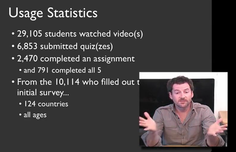
Coursera aims to allow tens or hundreds of thousands of people to be taught in one class, and this course proves that it can be done. According to Professor Klemmer, almost 30,000 students from watched the lecture material, and about 800 completed all of the coursework.
I alluded to it earlier, but the only way that this many students can be graded in a timely manner is through the use of peer evaluations. Before you complete each assignment, you are given exactly the same rubric as your peer assessors will have to grade your work. After the deadline for submission is up, you must go through a training exercise, grading five sample assignments in order to calibrate your scores with that of the professor. After this, you must grade at least five other students’ assignments; failure to do so results in a penalty to your grade. After you have seen these ten examples of other students’ assignments, you grade yourself using that same rubric. While this peer evaluation process was time consuming, it was an invaluable feedback tool, as it allowed me to measure myself relative to my classmates. In a traditional class, it’s rare to ever see others’ completed work, and in some cases it’s even against the honor code. In this online form, it is an absolutely crucial aspect of the course, as it allows the class to scale to a size unimaginable in physical classrooms.
I was extremely satisfied with the course, especially considering this was the first time it was offered through Coursera. Compared to my prior experience of using P2PU’s School of Webcraft to learn JavaScript, the quality of this course was much higher. It was a large time commitment, but I learned a lot and it forced me to actually implement an idea that I’d been kicking around in my head. There were a few hiccups and bugs in the Coursera system, including somewhat vague assignments, but Professor Klemmer noted in his farewell video that they are actively working to resolve these issues. If you get the chance to take this course, I highly recommend it.
Wind Map – a visualization to make Tufte proud

Edward Tufte is a noted proponent of designing data rich visualizations. His books, including the seminal The Visual Display of Quantitative Information have influenced countless designers and engineers. When I first saw Fernanda Viégas and Martin Wattenberg’s Wind map project via Michael Kleber’s Google+ post, I immediately became entranced with it. After studying it for some time, I feel that the designers must have been intimately familiar with Tufte’s work. Let us examine how this triumph of data visualization succeeds.
Minimalist and data dense
Tufte describes the data density of charts based on the amount of information conveyed per measure of area. There are two ways of increasing data density – increasing the amount of information conveyed, and decreasing the amount of non-essential pixels in the image.
No chart junk
You’ll immediately notice what’s not in the image – there’s no compass rose, no latitude or longitude lines, or any other grid lines separating the map from the rest of the page. There aren’t even dividing lines between the states. It isn’t a map at all about political boundaries, so this extra information would only detract from the data being conveyed.
More info
This map conveys two variables, wind speed and wind direction, for thousands of points across the United States. A chart conveying the same information would take far more space and the viewer would have no way of seeing the patterns that exist.
Does not abuse color
In the hands of less restrained designers, this map would be awash in color. You see this often in weather maps and elevation maps, as illustrated below:


The problem is that it is difficult to place colors in a meaningful order quickly. Yes, there is the standard ROYGBIV color ordering of the rainbow, but it’s difficult to apply quickly. Quick – what’s ‘bigger’ – orange or mauve? How about pink or green? Yellow or purple?. It is much easier to compare colors based on their saturation or intensity rather than hue. Color is great for categorical differences, but not so great for conveying quantitative information. Stephen Few sums it up nicely in his great PDF “Practical Rules for Using Color in Charts”
When using color to encode a sequential range of quantitative values, stick with a single hue (or a small set of closely related hues) and vary intensity from pale colors for low values to increasingly darker and brighter colors for high values
The designers uses five shades of gray, each of which is distinguishable from the others, rather than a rainbow of colors. Five options is a nice tradeoff between granularity and ease of telling the shades apart.
Excellent use of the medium
In a print medium, the shades of gray would have had to suffice to illustrate how fast the wind was moving. In this medium, the designers used animation to illustrate the speed and direction of the wind in a truly mesmerizing way.
Conclusion
This visualization does a lot of things right. In particular, it uses a great deal of restraint in conveying the information. Unlike some of the other examples I showed, it does not have extra chart junk wasting space, it does not abuse color to try to convey quantitative information, and it is absolutely aesthetically pleasing.
An interview with William Wilson, self-taught developer of Fret Tester and more
I recently had the opportunity to speak with William Wilson, the man behind Fret Tester, the best guitar fretboard learning application available for iOS, and one of the nicest designed apps I’ve used. I wrote about its great UI features in my previous post, The Best iPhone Guitar Fretboard App: Usability Lessons Learned. I wanted to pick the designer’s brain to see what lessons he could impart about designing usable applications. Here’s what he had to say.
Please tell me a little about your background. Do you design mobile applications for a living or as a hobby?
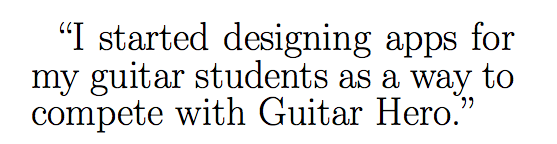
I’m actually a professional guitarist. I make my living teaching and performing classical and Spanish guitar in San Diego. I’ve always loved programming, starting with Basic, then HyperCard, Java, Flash, and eventually C. I started designing apps for my guitar students as a way to compete with Guitar Hero. I got tired of hearing: “Sorry Mr. Wilson, I didn’t practice, but I played Guitar Hero, does that count?” My first attempts were in Java, and were really awful. I’ve since done about 15 flash games (on my site guitargames.net) and 4 iOS apps. I’ve mostly learned from books and online tutorials. Right now it’s a hobby, but I’d love to do more of it.
As a musician first and foremost, what were the deficiencies you saw in the other published guitar apps and how did you aim to address them?
Traditionally when learning the neck students start with the natural (not sharp and flat) notes. That way they establish landmarks on the neck. I didn’t see this feature being a big part of any app. For me having the iPhone version just display the natural notes made sense (with a button to shift into sharps). Plus it’s tough to fit 12 buttons on the screen without clutter.
One of the biggest challenges I saw was how to zoom in on the neck. With many of the apps, I tried I lost a sense of where I was on the neck. But if the whole neck was shown it was too small. I decided to have my app zoom to the area that was being tested, but to allow sufficient area on either side so the user had a sense for where they were. Plus I included the option to zoom all the way out should the user prefer it. Related to this, I thought many of the apps lacked reinforcement. When you pushed the correct answer your finger covered it. I added the key style buttons so users could see what note the pushed and thus reinforce the correct answer.

Fret Tester screenshot - note that only the natural keys are shown and that the incorrect answer that was pressed pops up above the obstructing finger
How have your students received your work? Have you seen a measurable improvement in their progress?
I wish I could say that the app was a runaway success with my students… Unfortunately there is a mindset out there that you aren’t practicing unless you have a guitar in your hand. Mental practice is too often neglected, both with note naming and music theory. For the students who have taken my advice and used the app I’ve seen good things. I think separating the mental and physical complexities of the guitar is the way to go.
What advice would you offer to other people who are not programmers by trade but have an idea for a program or application that could simplify or improve some aspect of their everyday life? What resources have you found that were useful in turning your dream into reality?
There are tons of great resources out there. I always recommend http://masters-of-the-void.com/ as a first step. Also Steven Kochan’s Programming in Objective C is great for learning to write for iOS.
Outside “traditional” programming there were three books that greatly influenced me. One is The Non-Designer’s Design Book by Robin Williams, it will help you design a decent looking app. Second is Dave Woolridge’s Business of iPhone App Development, make sure you can sell one or two before you spend a year creating an app. And finally Don’t Make Me Think by Steve Krug, a guide for good UI principles.
Also I would say make sure to beta test often. I had about 8 people test Fret Tester and learned something from everyone. I like to hand someone my phone and say, try this. You’d be amazed at how they struggle to find something you thought was obvious.
You mentioned making sure that you can sell a product before you invest too much time in producing it. How do you recommend that app developers do this? Do you create a bare bones v 0.0 prototype and put it on the app store to gauge interest? Or do you have an alternative technique for market research?
First I look around and see if there are similar apps already out there. If there are a ton, and they’re good, I move on. If there are none I also move on, since there probably isn’t a market for what I’m designing, I want to at least see things that are similar. My goal is to design an app that reaches an already existing need. Not that I’m always successful in it. After reading Woolridge’s book, as well as listening to Seth Godin’s Purple Cow (Audio Book) I’ve improved in this area. I also just talk to people about my idea. If my wife looks at me like I’m nuts (which happens frequently) I try to rethink things.
Are you working on any new projects currently? Or do you have ideas for the next thing you want to work on?
Yes, I’ve been playing around with Adobe’s new Stage 3D and the Starling Framework. It seems promising. I’m hoping to release my first game using it soon. It is called Tab Warrior and is kind of a cross between Fret Tester and Space Invaders. Also, I’m going to try my hand at an Android app this year.
Great to hear. Thank you for taking the time to speak with me. Do you have any parting thoughts for the readers?
One thing I read in Apple’s docs was to only include features in an app that 80% of users will use. That totally changed my approach. If you look at Apple’s success I think its largely the result of keeping things simple and easy to use, and gearing products for the average user. Take the same approach in your apps.
Thank you to Mr. William Wilson for granting me this interview. You can find more about him on his website, WilliamWilson.com. See my Google+ album for more screenshots of Fret Tester.
The Best iPhone Guitar Fretboard App: Usability Lessons Learned
In my search for an app which would help me learn the frets of the guitar, I learned some general lessons on mobile apps and user interface design.
I have been playing guitar for about 3 years but have never mastered the fretboard. Now that I’m paying for lessons, there’s an economic incentive to learn – the faster I can locate notes on the fretboard, the less time and money I waste in my lesson.
At one point I toyed with writing an application myself, but I thought I’d look and see what was out there first before spending my time and effort. I’m glad I did, because there are some excellent offerings. I found five apps that fit the bill: Guitar Trainer HDx, Electric Guitar Fretboard Addict, Fretboard Warrior, Fretronome, and Fret Tester. Here’s the bottom line:
Developers:
- Aesthetics matter
- Design for fat fingers and not a mouse – touch targets must be large and separated
- What’s most convenient for the programmer is not necessarily best for the user
- Focus on the core functionality and and usability rather than extraneous features
- Do not make me accidentally click the ‘buy’ button – I can guarantee I will not complete the transaction
- Think twice about animation
Consumers:
- Don’t be cheap! The difference in quality between free and even a $2 app can be enormous
Guitar anatomy
To those unfamiliar with the guitar anatomy, I’d recommend reading the Wikipedia article. For the purposes of this post, all you have to know is that a real guitar neck is typically about two inches wide, about 25 inches long, has 6 strings, and about 20 frets. By pressing on a fret, you shorten the string and produce a higher note when the string vibrates. Each fret raises the pitch of the note by half a step.
Mastering the fretboard involves learning the correspondence between frets and note names. This can be tested in two directions – given a fret, name the note, and given a note and a string, identifying the corresponding fret.
UI challenges
As previously mentioned, an actual guitar neck is much, much larger than a mobile device’s screen. (By way of reference, my iPhone 4s screen is approximately 3.5 inches diagonal). How then can the app present an interactive fretboard when the strings are so close together on the physical screen?
Of the apps I tested, they took two approaches. Either they displayed the entire fretboard (usually only 12 frets, since that’s all you need to represent a full octave), or they displayed a zoomed in view of a few frets. Here are some of the pros and cons of each approach:
Global view (zoomed out)
Pros
- Better simulates what you see while actually playing guitar
- Provides global picture – easier to see relationship between notes and where frets fall in absolute and relative terms
Cons
- Frets and strings can be very close together and hard to distinguish
Zoomed in view (partial fretboard)
Pros
- Able to provide much more separation between strings, providing larger touch targets
Cons
- Hard to get a sense of where notes are relative to one another
- Does not simulate reality, unless you play guitar with blinders on with your nose an inch or two from the fretboard
The apps
Now that we’re acquainted with the fundamental UI challenge of a fretboard teaching/testing app, let us examine the competition.
Guitar Trainer HDx
I tried the free version; a paid version is available for $2.99.
This app takes the zoomed in approach to the fretboard, only showing approximately 4 frets at a time. While this gives a great amount of separation between the strings, it feels wrong. It uses the familiar inertial scroll pane that most iPhone apps do, but it seems ill-suited to the task. The view is so zoomed in that it’s very hard to get any sense of where you are in absolute terms.
An additional problem is that the app presents far too much information by default. The names of each note are displayed in a large font, as well as the number of each fret. On a real guitar, there are dots which indicate certain fret landmarks (3, 5, 7, 9, 12, 15, 17, on my guitar), and these crutches that the game provides will not force you to learn them. You can turn them off in the settings, but due to the cramped, zoomed in nature, it is hard to figure out where you are.
In training mode, the app presents you with random notes and you must identify them by name. The app supports both landscape and portrait modes, but there is something very off in its determination of your orientation. When the view switches, the fretboard stays static; the only thing that moves is the buttons at the bottom of the screen with the names of the potential notes. Often you will be holding it in one orientation and the notes suddenly shift 180 degrees as if it thinks you are holding the phone upside down. It’s supremely annoying.
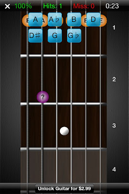
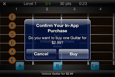
Don’t even bother trying to play the game in portrait/vertical mode; the buttons are so small and close together that you will often hit the wrong one. Even more annoying is the “Unlock Guitar for $2.99” button that resides approximately 10 pixels beneath the bottom row of buttons. I cannot tell you how many times I accidentally hit the button while trying to test it out.
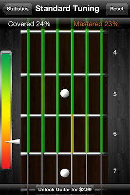
There is a training mode and then a testing/game mode in which you must identify a certain number of notes in the allotted amount of time. Throughout these modes, the app tracks the number of correct notes, misses, hit percentage, and total time. Additionally, there is an option to view the portion of the fretboard that you’ve mastered. This is one of the best parts of the app.
Aside from the previous annoyances, the game feels extremely sluggish. This is due in large part to the extraneous animation that occurs each and every time you identify a note. It’s as if you are watching someone who is learning PowerPoint for the first time and adds flying transitions to every slide – it might look OK the first time, but waiting a good 2 seconds each and every time gets old fast.
Finally, the game gives you one chance to identify the note. If you misidentify it (most likely due to the problems of the button size/placement I mentioned), it immediately flags it wrong and moves on. This is problematic as a pedagogical device because it does not give you a chance to correct your mistake before moving on. As you will see later, other apps handle this better.
All in all I cannot recommend this app, even for free.
Rating: 2 stars
Electric Guitar Fretboard Addict v1.4.3
Products by Michael Rylee
App store
Once again, I tested the free version; a paid version is available for $4.99
This app provides a photograph of a guitar neck rather than the vector graphics of some other apps. This is problematic because the photo suffers from perspective distortion – the bottom of the fretboard is much wider than the top of the fretboard, meaning the touch targets for the top notes are impossibly close together. The tab bar at the bottom of the screen wastes additional screen real estate, as does the large (approximately 1/4 of the screen width) bar on the right indicating which note to touch.
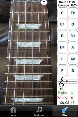
This app aims to teach you the fretboard in a much more regimented way. There are a total of 133 Rounds (approximately 30 are available in the free version) moving down the fretboard. Sometimes a note is presented and you must choose which string on the given fret matches it; sometimes a fret is highlighted and you must pick from the available notes on the right side of the screen. In a third mode, the note is represented not as its name but by its position on the musical staff.
The touch targets for identifying the note names are fairly large, but identifying which string corresponds to the given note is a harder feat, given the small amount of separation between the touch areas.
While I prefer the zoomed out view that this app provides, in general, the aesthetics are lacking. The logo looks like bad clipart and the app is littered with tiny, illegible thumbnails advertising his other products. The developer’s tagline says “Now you can practice anywhere you have a Mac, iPhone, iPod Touch, iPad, PC, or Windows Mobile Device!”, and unfortunately it shows. The look and feel is just not up to par with standard iOS apps.
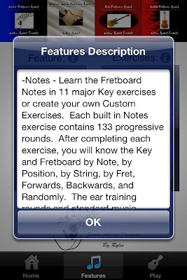
I admire the different ways in which the app tests you (note -> fret, fret -> note, note on staff -> fret), though I want less of a methodical walk through the fretboard and more of a drill to test my knowledge. The paid version is very highly rated but I did not get hooked on the free version enough to warrant a purchase.
Rating: 3 stars
Fretboard Warrior
Fretboard Warrior is an extremely minimalist app for testing your knowledge of the fretboard. You pick a duration of either 1, 2, 5, or 10 minutes and try to identify as many note names for the given fret as possible.
As I prefer, the app uses a zoomed out view of the fretboard to display the first twelve frets. Furthermore, since you are not touching the individual notes themselves, the fact that the strings are close together is not an issue. The issue comes from the fact that the buttons at the bottom of the screen are absolutely tiny. There’s really no reason the buttons need to be so small – there is an enormous amount of wasted vertical space on either side of the guitar neck, as well as on the top. If more vertical space were taken up, then the accidental notes could be moved out of line from the rest of the natural keys to provide more separation among the notes.
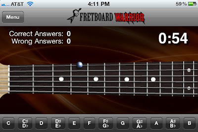
While I do appreciate minimalism, a little more functionality would be nice. For instance, it would be useful to be able to limit the range of frets and/or strings that are tested for students that are just starting out. If you already know the whole fretboard and are looking for a way to drill yourself and speed up your ability to identify the notes, then this app might do you well.
Rating: 3 stars
Fretronome
Free
Ahhh. Using Fretronome after some of these other products is like night and day – this is how an iOS app should look.
It provides a beautiful vector based graphic of the neck, which is slightly distorted in order to provide better separation between the strings. Unlike Fretboard Warrior, this allows you to restrict your practice to a string of your choice (though not a range of frets).
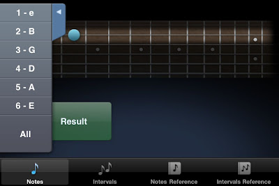
I really admire the developer of Fretronome for doing something ballsy and completely different than all the other developers. Rather than providing a list of buttons (with all the problems previously mentioned), he provides a single enormous button for revealing the hidden note name. Another tap of the button hides the note and queues up a new note to identify.
Since you never indicate the note, the app cannot automatically keep track of whether you got the note right or wrong. Nevertheless, it provides a great flashcard approach to learning the fretboard.
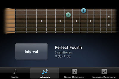
The app features an Intervals mode in which two frets are indicated and you must identify (again, in your head) what the musical interval is between them. It’s a great feature that I’m sure I will use more after I learn the rudiments of the fretboard.
Rating: 4 stars
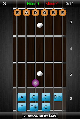
Fret Tester
$1.99 App store link
I decided to try a paid app to see how it differs from these free ones. I’m glad I did – I use it exclusively now.
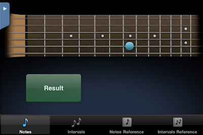
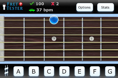
This app gives a horizontal view of the fretboard, defaulting to a zoomed in view of 6 of the frets, but optionally zooming out to show 12. Unlike Guitar Trainer HDx, the fretboard does not scroll in the zoomed in view; rather only the region of interest is displayed. Like Fretronome, the fretboard is rendered as an idealized graphical form rather than as a photograph. This ensures that there is no distortion of the fretboard. The aesthetics are excellent.
There are four modes – Name Note, Find Note, Notation, and Notes on Staff.
Name Note
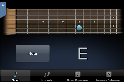
Name Note is the standard mode which all of these apps provide. Unlike Fretboard Warrior, it does not try to cram twelve notes into the bottom of the screen. Instead, the names of the 7 natural notes are displayed as large touch targets on the bottom of the screen (A, B, C, D, E, F, G). The accidentals (sharps and flats) are hidden and only revealed when the sharp key is pressed. When in that mode, the A turns to A#, C to C#, and so on and so forth.
This is a great design choice for two reasons. First, the natural notes are more common (7 out of 12 possible notes) so it makes sense that they should be more readily accessible. Second, by restricting the choices to 7 as opposed to 12, as many of the other apps do, the touch targets can be much bigger with more separation between them. This makes a huge difference in the usability of the app, as you will rarely, if ever, click the wrong button on accident.
When you misidentify a note twice in a row, the correct answer will be highlighted green, but you must still make the correct choice before the next note is displayed. This is a good feature, as you must always get the right answer to move on, even if the app helps. In contrast, and as discussed earlier, Guitar Trainer HDx immediately flags your answer as “WRONG!” and automatically moves you to the next note.
Unlike some of the other apps, there is no timed mode. I don’t mind this, as I find a ticking clock stressful and distracting. It does give you a measure of your speed by displaying a ‘beats per minute’ value (the rate at which you are identifying notes/frets), as well as a graphical representation (turtle, hare, car, rocket ship). I like the simplicity of the icons and prefer this way of measuring speed to a time trial.
Playing with this app provides a much more fluid experience and helps me enter the flow state much more than the others. I struggled to determine why that was until I noticed two main differences.
The first is that there is no extraneous animation between the identification of one note and the display of the next. For instance, Guitar Trainer HDx hides all the other answers after you’ve made the correct choice, and displays a huge CORRECT! on the screen which rotates around and leaves the screen. I’m all for positive reinforcement, but I don’t need that much, and I don’t need the second or two pause between the identification of one note and the display of the next. This app moves on to the next note with no hesitation, allowing you to drill yourself as fast as you can think.
The second difference is more technical. To explain it, first some background. What we think of as a mouse click (or tap on the mobile world) is really two separate actions – the mouse button is pressed and subsequently released. In most cases the time between these two actions is so tiny that we can treat the two as the same. The distinction between the press and release is important. Why? Try this test – press and hold the mouse over the following link. Now drag the mouse out of the url and release the mouse. Note that you have effectively canceled the navigation. The same is true of most button implementations – the action does not occur until the mouse is released within the button area. This pattern of having actions occur on mouse release is, in general, a great thing – it allows you to rethink your decision before commiting to it.
Instead of doing what is standard, Fret Tester uses the press on the note button, rather than release, to trigger the action. This means that by the time your finger has come off the screen the hit has already been registered and the next note displayed. This contributes to the feeling of speed. Since there are no real negative consequences for making a wrong note choice (it’s not like you’re going to delete an important document, for instance), the extra speed increase is worth the lack of a safety net. It’s a very subtle touch but it makes a big difference.
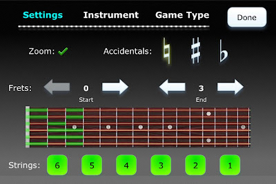
In terms of features, this mode goes beyond all the others I tried. The options allow you to focus on the areas you need to improve. For instance, you can restrict the range of the fretboard tested (e.g. frets 3-6) as well as the specific string or strings (the B string is a weak area for me personally). You can also choose whether to test accidentals (sharps or flats) or only the natural notes. I personally choose to play on the natural note mode since it works so well with the seven large notes displayed at the bottom of the screen. I find this combination of options extremely appealing as it allows you to focus just on the weak areas rather than wasting your time with what you have already mastered.
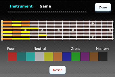
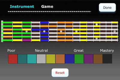
You can track your progress by means of a graphical representation of your mastery of each fret, accessible via the Stats menu. I have one minor complaint about this display – the level of mastery is mapped to seemingly arbitrary colors. In my opinion, this should have been a linear interpolation between two colors (e.g. white to black) in order to more easily determine which frets were strongest and which were weakest, without having to continually consult the color code. Nevertheless, it is very compelling to track your progress and try to turn all of the frets black.
Other modes
Find Note
Find Note is a rarer mode; only Electric Guitar Fretboard Addict had this feature. In this mode, you are given a note name and four consecutive dots on a string and must choose the correct fret. The touch targets are big and well-spaced in the zoomed in mode. When zoomed out, it’s ocasionally hard to select the correct fret, but the fact that the choices are limited to one string (rather than adjacent strings) obviates most of the annoyance.
Notation
In notation, a note on the staff appears and you must touch the corresponding fret. I haven’t used this mode much yet, but it’s a nice bonus.
Notes on Staff
Similar to Notation, this mode has you name a note on the staff rather than find its place on the fretboard. I have many years of experience reading sheet music, but it’s also been awhile, so this is a nice refresher.
Conclusion
This app is just about perfect. The core Find Note experience is by far the best out of all the apps I tried, in large part due to the care put into the user interface concerns. Even if you never touch the other modes and features (e.g. bass, mandolin, 5 string bass, left handed mode, alternate tunings), $2 is a steal for the core Find Notes drill.
Rating: 4.5 stars
Conclusion
This post explored five different applications’ approaches to the user interface challenge of representing a large physical guitar fretboard on a small mobile screen. We saw that certain applications did not pay enough attention to the separation needed between adjacent touch targets, or to the size of each target. We also saw how the ubiquitous scroll pane works well for standard apps but does not work well for a task where global positioning and spatial relationships are important.
Fret Tester was the clear winner of the contest, due to its great aesthetics, usability, and design. Its modes eschewed flash and animation for a fast, accurate, responsive testing environment. There is no ticking clock to exert pressure on you, but there are clear visual indications of progress (both in terms of speed, accuracy, and overall progression on the fretboard).
While this post focused on guitar fretboard applications, many of these user interface lessons can be applied to any mobile endeavor.
Comparison chart
Please see the Google doc summarizing the various featured of the tested products.
TextMate – Introduction to Language Grammars: How to add source code syntax highlighting embedded in HTML
I’ve blogged about TextMate a few times in the past, and with good reason – it’s an extremely versatile, light weight, powerful text editor for the Mac. One great feature of TextMate is its extreme customizability. Today I’m going to show how to modify one of the TextMate language files in order to add support for Java code within HTML text.
Why is this useful? My workflow for producing blog posts is often to write the post in TextMate using the Markdown markup language, which I then convert to HTML. WordPress has the ability to syntax highlight and provide a nice monospaced version of sourcecode within a post if it’s delimited by <code></code> tags. While the sourcecode comes out fine in the final post, it would be nice to have the syntax highlighting show up from within the Markdown view (i.e. while I am composing a blog post). Let’s get started by looking at how language grammars work in TextMate.
Introduction to Language Grammar Editing
The language support in TextMate is extremely powerful, but it’s a little complicated to get started. In essence, a language defines a series of rules mapping patterns to scopes. For instance, the Java language grammar defines a scope for comments, a scope for control characters, and so on and so forth. The scope is extremely important for many reasons. A few of them are
- The scope determines whether text is spellchecked or not (a top level scope of
sourceis not spell checked; one that istextwill be) - It provides syntax highlighting, as certain scopes are associated with certain colors.
- Snippets can be targeted to only run when within a certain scope. (See this article on Scope selectors for more.) For instance, all the Java snippets are defined as only being active in the
source.javascope.

As an aside, you might wonder why the scope is called source.java as opposed to java.scope. The reason is that some scope selectors can target the more general case (scope), whereas those concerned with java can target the more specific scope (java.scope).
Since someone has already done the hard work of creating a language definition for Java and for creating all of the snippets that support it, we want to leverage this body of work. All we need to do is ensure that text between the java tags is considered to be part of the source.java scope, and everything will just work.
First, let us look at a sample grammar file. Open up the HTML language definition file by going to Bundles -> Bundle Editor -> Edit Languages, or via the shortcut ⌃ ⌥ ⌘L, and choose the HTML option. You’ll be presented with a rather inscrutable, unstyled document to the right. The first thing you should do, and which I found out the hard way, is copy all that text and paste it into a new document.


When you paste the text into the document, the text is unstyled and interpreted as plain text. In order to force TextMate to interpret this as a language grammar, you must click the item in the lower middle that says “Plain Text” and choose “Language Grammar” from the dropdown box. The document should look a lot nicer after this step:


Take a look through the grammar, but don’t get bogged down in the details. The important thing to look at is the list of patterns defined. Here’s just a small section:
    patterns = (
        {   name = 'meta.tag.any.html';
            begin = '(]*>)';
            end = '(>()';
            beginCaptures = {
                1 = { name = 'punctuation.definition.tag.html'; };
                2 = { name = 'entity.name.tag.html'; };
            };
            endCaptures = {
                1 = { name = 'punctuation.definition.tag.html'; };
                2 = { name = 'meta.scope.between-tag-pair.html'; };
                3 = { name = 'entity.name.tag.html'; };
                4 = { name = 'punctuation.definition.tag.html'; };
            };
            patterns = ( { include = '#tag-stuff'; } );
        }
This is the first pattern that will attempt to match. You don’t need to understand all of it, but you should understand that the parentheses in the regular expressions denote capturing groups, which are then referenced in the beginCaptures and endCaptures tags. These assign scopes to the various captured groups. Note too that we can recursively include patterns (via the include = '#tag-stuff' line) which assign scope to various parts of the matched text. This allows us to define a pattern one time and reference it in multiple places, which cuts down on code duplications.
If you look through the HTML grammar, you’ll notice that some embedded code is automatically detected and set to have the matching text use the corresponding language:
ruby = {
    patterns = (
        {   name = 'comment.block.erb';
            begin = '';
            captures = { 0 = { name = 'punctuation.definition.comment.erb'; }; };
        },
Here, any times the <%# %> tag pair is seen, the entire block is captured and assigned to the scope punctuation.definition.comment.erb, which has the effect of distinguishing it from surrounding text. You can see this in action in the following screenshot:

In addition to the fact that the ERB snippet is syntax highlighted, take note of the popup in the screenshot showing “text.html.basic” and “comment.block.erb”. At any point in any TextMate file, you can hit ⌃ ⇧P (Control Shift P) to get the current scope of the cursor. This is extremely useful for debugging why certain elements are not being selected or assigned the scope you think they are.
Adding Java support
While using a TextMate window to edit the grammar is extremely nice, unfortunately you cannot test your changes interactively here. You must copy and paste the contents back to the original grammar window, overwriting the contents, and then press Test. This will reload the grammar and you will see the change reflected in any window using that grammar currently.
With that in mind, let’s add the support for embedding Java within our Markdown blog posts.
The basic pattern is pretty simple:
    {   name = 'source.java';
        comment = 'Use Java grammar';
        begin = '\';
        end = '\[/sourcecode\]';
        patterns = ( { include = 'source.java'; } );
    }</pre>
</div>
I look for the literal string <code></code> to start the pattern, and then the literal string <code>
 to end it.  I have to escape the brackets due to the fact that they have a special meaning within regular expressions ([aeiou] matches any vowel, while \[aeiou\] matches the literal string [aeiou]).
By adding this line to the top of the patterns, it is run before any of the others.  (Remember, we have to actually add it to the HTML grammar within the Bundle Editor, not just the TextMate window with the grammar inside of it).  Once the line is added and you press Test, the Java highlighting beings to work.
Here’s what a snippet of Java embedded in a Markdown blog post looked like without this change:

And after:

Conclusion
Language support in TextMate is a very complex task, and one that cannot be adequately covered in a single post.  I’ve shown here how to add a small snippet to the HTML grammar to allow syntax highlighting of sourcecode delimited by special blocks.  This technique could be expanded to support any number of other programming languages.
The ability to customize TextMate through editing snippets and language grammars makes it extremely powerful.  I hope this has only whetted your appetite to learn more.  If it has, please see the macromates site which has more information about this.
WorkFlowy – free minimalist list webapp
First, let me describe the two main problems I have with todo/note taking software I’ve tried previously. Secondly I’ll show how WorkFlowy alleviates these problems.
TODO: fix these problems!
There have certainly been other TODO list applications that I have used in the past, but they usually suffer from at least one of the following problems:
- A
- A.1
- A.2
- A.2.i
- A.2.ii
- A.2.iii
WorkFlowy
With respect to #1, WorkFlowy is as barebones as you can get. There are no labels, tags, colors, due dates, etc. All you do is enter plain text. If you need all those bells and whistles, then WorkFlowy might not be for you. But if all you want is an online repository for your random thoughts, I have not found anything better.
Workflow is also excellent at managing deeply hierarchical information, as I described in number two. It supports the standard tab/shift+tab combo to indent/unindent items.

Indent text with the tab key
Here you see all the top level notes that I have.

Top level lists

After the chores node has been expanded

Zoom in

Breadcrumbs allow you to back out of your current location
This is an extremely effective UI technique, as it allows you to create arbitrarily complex and nested hierarchies but focus on only a small piece of it at any one time. This allows you to switch between nested and essentially flat views of your data at will, simply by zooming into the relevant portion of the tree and by collapsing the children nodes whose detail you don’t care about.
Conclusion
Give an indication of why a button is disabled

An example of an enabled and disabled button
Stack Overflow profile

