Archive
YAGNI and the scourge of speculative design

Robert Anning Bell [Public domain], via Wikimedia Commons
I’ve been programming professionally for five years. One of the things that I’ve learned is YAGNI, or “You aren’t gonna need it”.
It’s taken me a long time to learn the importance of this principle. When I was a senior in college, I had a course that involved programming the artificial intelligence (AI) of a real-time strategy game. For our final project, our team’s AI would be plugged in to fight against another team’s. I got hung up on implementing a complicated binary protocol for the robots on our team to communicate efficiently and effectively, and our team ended up doing terribly. I was mortified. No other team spent much time or effort on their communication protocol, and only after getting everything else up and running.
In this essay I’ll primarily be talking about producing code that’s not necessary now, but might be in the future. I call this “speculative design” and it’s what the YAGNI philosphy prevents.
First, let’s discuss how and why this speculative design happens. Then we’ll discuss the problems with giving into the temptation.
Why does it happen
I can only speak to my own experience. The times I’ve fallen into this trap can be classified into a few categories:
- It’s fun to build new features
- It feels proactive to anticipate needs
- Bad prioritization
Building features is fun
Programming is a creative outlet. It’s incredibly satisfying to have an idea, build it in code, and then see it in use. It’s more fun than other parts of development, like testing, refactoring, fixing bugs, and cleaning up dead code. These other tasks are incredibly important, but they’re ‘grungy’ and often go unrewarded. Implementing features is not only more fun, it get you more visibility and recognition.
Proactive to anticipate needs
A second reason one might engage in speculative design is to be proactive and anticipate the needs of the customer. If our requirements say that we must support XML export, it’s likely that we’ll end up having to support JSON in the future. We might as well get a head start on that feature so when it’s asked for we can delight the customer by delivering it in less time.
Bad prioritization
This is the case with the story I started this piece with. I overestimated the importance of inter-robot communications and overengineered it to a point where it hurt every other feature.
In this case, the feature was arguably necessary and should have been worked on, but not to the extent and not in the order that I did. In this case I should have used a strategy of satisficing and implemented the bare minimum after all of the more important things were done.
Why is it problematic
I’ve described a few reasons speculative code exists. You’ve already seen one example of why it’s problematic. I’ll detail some other reasons.
More time
Let’s start simple. Time spent building out functionality that may be necessary in the future is time not spent on making things better today. As I mentioned at the start of this post, I ended up wasting hours and hours on something that ended up being completely irrelevant to the performance of teams in the competition, at the expense of things that mattered a lot more, like pathfinding.
Less focus
Since there is more being developed, it’s likely that the overall software product is less focused. Your time and attention are being divided among more modules, including the speculatively designed ones.
More code
Software complexity is often measured in lines of code; it’s not uncommon for large software projects to number in the millions. Windows XP, for instance, had about 45 million lines.
Edsger Dijkstra, one of the most influential computer scientists, has a particularly good quote about lines of code:
My point today is that, if we wish to count lines of code, we should not regard them as “lines produced” but as “lines spent”: the current conventional wisdom is so foolish as to book that count on the wrong side of the ledger.
I once equated lines of code produced to productivity, but nothing could be further from the truth. I now consider it a very good week if I decrease the lines of code in the system, by deleting chunks of code or rewriting them to be simpler and shorter.
The extra code and complexity associated with speculative coding is very expensive.
- It slows down readers of the code
- It slows down building the software (especially if it pulls in more dependencies)
- It adds additional tests that slow down the test suite
- It is likely to add more bugs (more code generally equals more bugs)
Sets unrealistic expectations
Say that you design a feature because you think that the customer is going to want. Imagine that you actually got it right – what they end up asking for is essentially identical to what you’ve implemented. You deliver it to the customer a full week before you promised it.
You might look like a hero, but this sets a very bad precedent. It sets unrealistic expectations as to how much work the feature took to implement, and might lead to the customer setting impossible deadlines for features of similar scope. If you were able to finish that feature early, they might reason, there’s no reason you shouldn’t produce the next feature just as quickly.
You’re probably a bad judge of what will be needed in the future
It’s hard enough to build software from detailed specifications and requirements. Guessing about what the specifications and requirements of a feature that isn’t needed yet is likely to end up with a product that doesn’t make anyone happy. It will likely match the designers’ mental model but not the users, since there was inadequate input from them.
It’s hard to remove features once they exist
Say that you’re designing the export feature of your software. You imagine there will be a whole lot of formats you want to support, but at the moment the only hard and fast requirement is CSV (comma separated value) format. As you’re writing the CSV export code, you see how it would be trivial to implement JSON encoding. And while you’re at it, you throw in XML. You were required to produce CSV but now you have JSON and XML support too. Great!
Well, maybe. Maybe not. A year down the line you notice that only a small percentage of your users export to XML, but the feature has led to a disproportionate number of support tickets. Now you’re in a tough place – if you kill the feature, you’ll irritate these power users. Furthermore, you will have effectively wasted all of the time in implementing the feature in the first place, and all the subsequent patches.
I have seen little-used features remain in production because they’re too much trouble to delete and alienate the few users of said feature. Which leads to…
Increased risk of dead code
Imagine that you’ve implemented a new feature but it’s not ready for prime time yet. Or maybe you used it once or twice but it’s not worth turning on for your normal service. You don’t want to kill the feature entirely, as it might have some utility down the line. (Warning bells should be going off about now) You decide to hide the feature behind a configuration flag that defaults to off. Great! The feature can easily be reenabled should you ever need it again.
There’s just one problem – it gets turned on accidentally interacts catastrophically with the rest of the system. Your software deals with financial transactions and it ends up costing your company 460 million dollars.
This sounds unlikely – except it’s true. This is essentially what happened to Knight Capital in 2012.
From the Security and Exchange Commission report of the incident:
Knight also violated the requirements of Rule 15c3-5(b) because Knight did
not have technology governance controls and supervisory procedures
sufficient to ensure the orderly deployment of new code or to prevent the
activation of code no longer intended for use in Knight’s current operations
but left on its servers that were accessing the market; and Knight did not
have controls and supervisory procedures reasonably designed to guide
employees’ responses to significant technological and compliance
incidents;
This is one of the most visible failures caused by dead or oxbow code. I am not suggesting that Knight Capital speculatively developed the feature that malfunctioned. What I am saying is that
- It’s dangerous to leave dead code around in a system
- Speculative development is likely to lead to features that are not used often and are more likely to be dead code than if they were completely spec’ed out as in normal development
- Therefore speculative development puts you at a greater risk of dead code problems
Don’t allow dead code stay in the codebase. If you should ever need it again, you should be able to retrieve it from the version control system. You almost certainly won’t.
Conclusion
As an engineer, it’s easy to fall into the trap of implementing features before they’re actually needed. You’ll look productive and proactive. In the end, it’s best to avoid this temptation, for all of the problems I’ve mentioned. These include
- the extra code takes time to write, test, debug, and code review
- it contributes to a lack of conceptual focus in the system
- if done to please a customer, it sets unrealistic expectations for the development of other features
- it imparts an extra maintenance cost for the rest of the lifetime of said feature
- it will be difficult to remove the feature if and when its lack of use becomes apparent
- it puts you at increased risk of leaving dead code in the system, code which may later be accessed with bad consequences
I love Dijkstra’s notion of ‘lines spent’. Do you want to spend your time and lines of code on a speculative feature? Just remember – you aren’t gonna need it.
Coursera’s Human-Computer Interaction Class: A triumph of education
I recently took a course on Human-Computer Interaction on Coursera, taught by Scott Klemmer from Stanford University. According to its About page, Coursera is a
social entrepreneurship company that partners with the top universities in the world to offer courses online for anyone to take, for free. We envision a future where the top universities are educating not only thousands of students, but millions. Our technology enables the best professors to teach tens or hundreds of thousands of students.
After having completed this course, I feel that Coursera provides an amazing service. It’s not perfect, but it is far superior to any online courses I’ve taken so far.
Motivation
I have been fascinated with design and making things ‘user friendly’ ever since reading Donald Norman’s The Design of Everyday Things in college. This book details why certain designs fail while others are intuitive and obvious. One of the things that stuck with me is the concept of affordances – buttons ‘afford’ being pressed, dials ‘afford’ being turned, handles ‘afford’ being pulled. To this day, it is one of my biggest pet peeves to find doors that open the wrong way. During a recent trip to Paris, I took pictures of some of the design failures I saw, including this particularly nasty door in the hotel.


It’s the exact same handle on both sides of the door, but it is designed to swing in only one direction. We walked through that door at least 10 times but each and every time we had to think about how to open it; we had to push an interface that was clearly designed to be pulled.
This is a somewhat trivial example, but design can have incredible safety implications as well. A recent article claims that poor design contributed to the 2009 Air France Flight 447 crash:
In the next 40 seconds AF447 fell 3,000 feet, losing more and more speed as the angle of attack increased to 40 degrees. The wings were now like bulldozer blades against the sky. Bonin failed to grasp this fact, and though angle of attack readings are sent to onboard computers, there are no displays in modern jets to convey this critical information to the crews. One of the provisional recommendations of the BEA inquiry has been to challenge this absence.
(Emphasis mine)
When I heard from a coworker that Coursera was offering a course on Human Computer Interaction, I knew I had to take it.
Structure
The course was slated to last 5 weeks though it actually took 6 due to an extension in one of the assignments. Some of the topics included needfinding (determining what actual people need in an interface and how they make do with the status quo), paper prototyping techniques, storyboarding techniques, heuristic evaluation, lab usability studies.
The course had four main components each week:
- lectures
- quizzes
- projects
- peer assessment
Lectures
The lectures were presented as a series of videos broken into approximately ten minute chunks. Each video had the same slides that the professor presented as downloadable attachments. Most of the videos also had subtitles for a few different languages; I heard complaints on the forums that some of the later videos were without subtitles but as I am a native English speaker, it did not affect me.
There were two nice touches I liked in the lectures: embedded quizzes and video playback speed.
In almost every video, there would be a break in the video where an interactive quiz was presented based off of what Professor Klemmer had just presented. It’s a nice pedagogical trick to make sure you’re paying attention and understanding the material.
I found the default pace of the lectures a little slow, but the embedded video player allowed me to speed up the videos. I found the lectures were comfortable to watch at 1.75x speed.
Quizzes
In addition to the mini quizzes embedded in the videos, there were multiple choice quizzes each week based off of the lectures. These quizzes gave instant feedback after submission, which I appreciated. Students could retake the quizzes a few times until they pass; in general I found that the quizzes were easy if you paid attention to the video lectures.
Projects
The course hammered home the point that designers and implementers are the worst people to judge their own work. They have too much knowledge, and their mental model is nothing like that of the ‘average’ user. Furthermore, they are too close to the system to provide an objective evaluation – if they labored weeks on a particular feature, they’re going to inflate its importance, even if the design as a whole would improve without it. The meat of the course, namely the assignments and peer evaluations, were imbued with this idea. We were tasked with building a software prototype and enlisting the help of users to test it and improve its design.
At the start of the course, we were presented with three options for themes our design projects could take on. From the design briefs page:
- Change – “Use the power of new technology to create an application or service that facilitates personal or social behavior change”
- Glance – “Find people and design a personal dashboard tailored to their needs”
- Time – “Redesign the way we experience or interact with time”
I chose the Glance design brief. My inspiration was a hideously complicated board game named Twilight Imperium. It’s a fun turn based conquer-the-galaxy board game, but it has some serious usability issues.

It takes an incredibly long time to learn the rules, and an even longer time to play. The first game I played took literally 16 hours over the course of a few days, and the fastest game I’ve ever completed took 5 hours. Two aspects of the game struck me as particularly frustrating:
- The technology tree (there are 24 technologies grouped into four categories, spread across two massive pages in the instruction manual)
- Combat (each of the ~6 ship types has a different base attack rate, which can be modified by your race, action cards, and political cards in effect)
In every game I’ve played, choosing technologies to buy and the combat bring the game to a screeching halt. I decided that my project would be to build an application of some sort to help make one of these aspects more intuitive and fun.
I designed two storyboards, one for the combat app and one for the tech tree app idea, in order to solidify who the app was for (board gamers who play TI), where it would be used (wherever they play), and the problems it solved (takes too long to pick technologies and/or fight, too much has to be kept in players’ heads)

Next I decided to focus on the technology tree idea and came up with two mockups of divergent designs of this application using the wireframing software Balsamiq. (Longtime readers of this blog might remember that I used Balsamiq to make the illustrations for my post explaining how ListView works in Android). I decided that I wanted to drastically simplify the tree structure as laid out in the instruction manual and instead only display the prerequisites when necessary. (Technology X cannot be purchased until you purchase A AND B or C…).
One of my designs was inspired by the slick UI of Diablo 3 for crafting items:
 .
.
Here’s the Balsamiq wireframe for that design:

The second design I created was a grid layout:

After receiving (and performing) a ‘heuristic evaluation’ of the prototype, I decided to actually implement the grid layout after making a few modifications. In the final few weeks, I implemented an interactive version using d3.js and HTML tables. I am no web designer, and I’m embarrassed by some of the hacks and nonfunctioning pieces of the prototype, but overall I am pleased with how it came out. The final assignment was to perform an honest to goodness usability test with at least three participants. The feedback I received from them will be invaluable for improving the prototype in the coming weeks. You can play with the same version of the prototype that my testers did if you’d like.

Conclusion
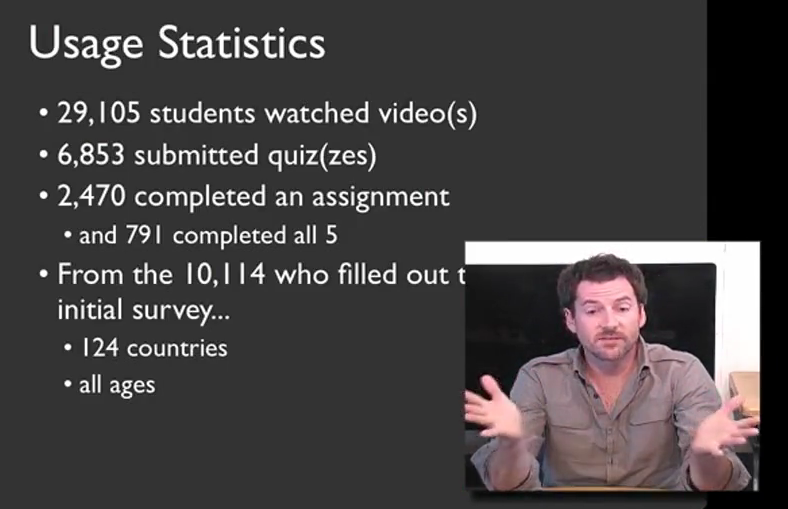
Coursera aims to allow tens or hundreds of thousands of people to be taught in one class, and this course proves that it can be done. According to Professor Klemmer, almost 30,000 students from watched the lecture material, and about 800 completed all of the coursework.
I alluded to it earlier, but the only way that this many students can be graded in a timely manner is through the use of peer evaluations. Before you complete each assignment, you are given exactly the same rubric as your peer assessors will have to grade your work. After the deadline for submission is up, you must go through a training exercise, grading five sample assignments in order to calibrate your scores with that of the professor. After this, you must grade at least five other students’ assignments; failure to do so results in a penalty to your grade. After you have seen these ten examples of other students’ assignments, you grade yourself using that same rubric. While this peer evaluation process was time consuming, it was an invaluable feedback tool, as it allowed me to measure myself relative to my classmates. In a traditional class, it’s rare to ever see others’ completed work, and in some cases it’s even against the honor code. In this online form, it is an absolutely crucial aspect of the course, as it allows the class to scale to a size unimaginable in physical classrooms.
I was extremely satisfied with the course, especially considering this was the first time it was offered through Coursera. Compared to my prior experience of using P2PU’s School of Webcraft to learn JavaScript, the quality of this course was much higher. It was a large time commitment, but I learned a lot and it forced me to actually implement an idea that I’d been kicking around in my head. There were a few hiccups and bugs in the Coursera system, including somewhat vague assignments, but Professor Klemmer noted in his farewell video that they are actively working to resolve these issues. If you get the chance to take this course, I highly recommend it.
Stack Overflow profile

