Archive
Wind Map – a visualization to make Tufte proud
Edward Tufte is a noted proponent of designing data rich visualizations. His books, including the seminal The Visual Display of Quantitative Information have influenced countless designers and engineers. When I first saw Fernanda Viégas and Martin Wattenberg’s Wind map project via Michael Kleber’s Google+ post, I immediately became entranced with it. After studying it for some time, I feel that the designers must have been intimately familiar with Tufte’s work. Let us examine how this triumph of data visualization succeeds.
Minimalist and data dense
Tufte describes the data density of charts based on the amount of information conveyed per measure of area. There are two ways of increasing data density – increasing the amount of information conveyed, and decreasing the amount of non-essential pixels in the image.
No chart junk
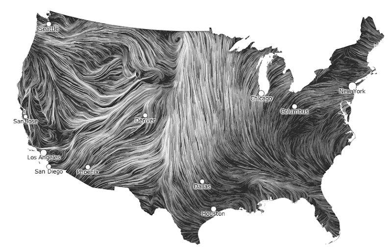
You’ll immediately notice what’s not in the image – there’s no compass rose, no latitude or longitude lines, or any other grid lines separating the map from the rest of the page. There aren’t even dividing lines between the states. It isn’t a map at all about political boundaries, so this extra information would only detract from the data being conveyed.
More info
This map conveys two variables, wind speed and wind direction, for thousands of points across the United States. A chart conveying the same information would take far more space and the viewer would have no way of seeing the patterns that exist.
Does not abuse color
In the hands of less restrained designers, this map would be awash in color. You see this often in weather maps and elevation maps, as illustrated below:


The problem is that it is difficult to place colors in a meaningful order quickly. Yes, there is the standard ROYGBIV color ordering of the rainbow, but it’s difficult to apply quickly. Quick – what’s ‘bigger’ – orange or mauve? How about pink or green? Yellow or purple?. It is much easier to compare colors based on their saturation or intensity rather than hue. Color is great for categorical differences, but not so great for conveying quantitative information. Stephen Few sums it up nicely in his great PDF “Practical Rules for Using Color in Charts”
When using color to encode a sequential range of quantitative values, stick with a single hue (or a small set of closely related hues) and vary intensity from pale colors for low values to increasingly darker and brighter colors for high values
The designers uses five shades of gray, each of which is distinguishable from the others, rather than a rainbow of colors. Five options is a nice tradeoff between granularity and ease of telling the shades apart.
Excellent use of the medium
In a print medium, the shades of gray would have had to suffice to illustrate how fast the wind was moving. In this medium, the designers used animation to illustrate the speed and direction of the wind in a truly mesmerizing way.
Conclusion
This visualization does a lot of things right. In particular, it uses a great deal of restraint in conveying the information. Unlike some of the other examples I showed, it does not have extra chart junk wasting space, it does not abuse color to try to convey quantitative information, and it is absolutely aesthetically pleasing.
Stack Overflow profile

