Archive
Saddest Map In America – “Missed Connections” data mining from Craigslist

Entertaining infographic and commentary by Andrew Sullivan on where missed connections occurred most frequently on a per state basis. Highlights: California = 24 Hour Fitness, the south = Walmart, Nevada = Casino
Slips vs mistakes – what WordPress gets wrong that Blogger and Tumblr get right
You’ve just finished a blog post and are in the process of scheduling it to go out at a certain time to maximize exposure. You click the confirmation button, only to see your post go live immediately rather than the time you scheduled.
Oops. What went wrong? This happened to me once (and nearly multiple times) due to poor UI design on WordPress.com. Fortunately I only lost a few potential page views; in other cases early releases of information have cost businesses dearly.
Scheduling a post
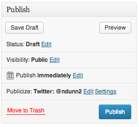
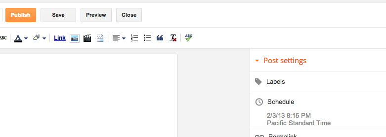
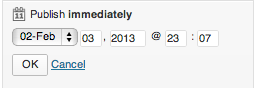
Here is the dialog for publishing on WordPress.
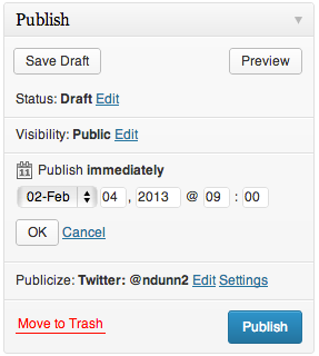
If we click Edit, UI elements reveal themselves for choosing a date and time at which to publish the post.
It was at this point where I pressed the Publish button and my post went live immediately. Do you see what I did wrong?
Slips vs mistakes
From my time in Scott Klemmer’s Human-Computer Interaction (HCI) course, I learned that errors can divided into two classes – slips and mistakes.
A slip is when the user has the correct mental model of the interaction yet makes an error on accident. For instance, if two buttons are close together and you click one rather than the other on accident, that would be a slip. These can often be addressed through things such as making touch targets bigger and adding separation between buttons. From the screenshot, you can see that the Publish button is very large and there’s nothing next to it to accidentally press. (The decision to have the Move to trash button on the same row is rather strange, but it is sufficiently far away that I did not accidentally click on it). This is not the type of error I made.
A mistake stems from the user having the incorrect mental model. That is precisely what happened to me. I did not accidentally press the Publish button; I intentionally pressed it but I had the wrong idea to what would happen. Let’s investigate why.
Convention
What makes interfaces intuitive? Part of it comes from adhering to convention and following the Principle of Least Astonishment. The Wikipedia article sums it up nicely:
In more practical terms, the principle aims to exploit users’ pre-existing knowledge as a way to minimize the learning curve for instance by designing interfaces borrowing heavily from “functionally similar or analogous programs with which your users are likely to be familiar.”
This publishing widget violates conventions in a few ways.
Discarding unsaved user input without warning.
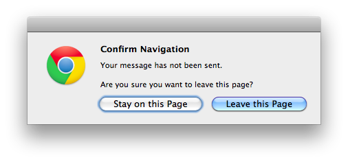
Many programs will warn if you’re about to do something destructive to unsaved input. For instance, if you are half way through a message in Gmail and attempt to close the tab or browser, you will see the popup warning:
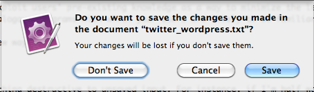
Similarly, all Cocoa applications on Macs will clearly show unsaved state and warn if you try to close a program without saving:

If there are form elements whose state is about to be destroyed by an action, it would make sense to issue a warning about that. This WordPress form does not do the user that courtesy.
Too much state
Most programmers understand that there is state saved on both the server and client. The client will fetch the data from the server and adjust its UI controls to match. Changes to the UI controls don’t automatically get sent to the server; generally there’s some final OK/Cancel action to either accept or discard the changes. Normal users should not need to know this – it should just work. This control exposes too much information unnecessarily. Why would one care what the current server side state is vs what’s in the UI control for each individual section? Why wouldn’t she just set the options the way she likes and hit one button to apply all of the changes?
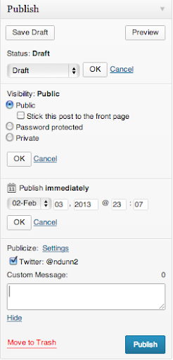
Even if she understands the distinction between client side and server side state (like I do), it is an extremely unfamiliar interface to have to hit OK on a subsection of a form before finally submitting it. I cannot think of one other example that does this. It is convention that hitting the big Confirm button at the end of a form will use whatever information is currently in the form.
In addition to not expecting to have to hit another OK button in order to have my changes applied, this form suffers an additional problem – there is too little contrast between the OK button and the form. Note how the OK button all but disappears with the least amount of blur:

The eye is naturally drawn towards the big blue button in the lower right, which is exactly what I clicked on.
If I had pressed OK, then the Publish button would have changed its text to “Schedule.” Without knowing that that change would occur, I assumed that this control behaved like all others I had used before and so made the mistake.
Alternatives
Let’s look at alternative blogging sites and see how they do things better.
Blogger
Blogger separates the configuration of the publishing options from the publish button itself.
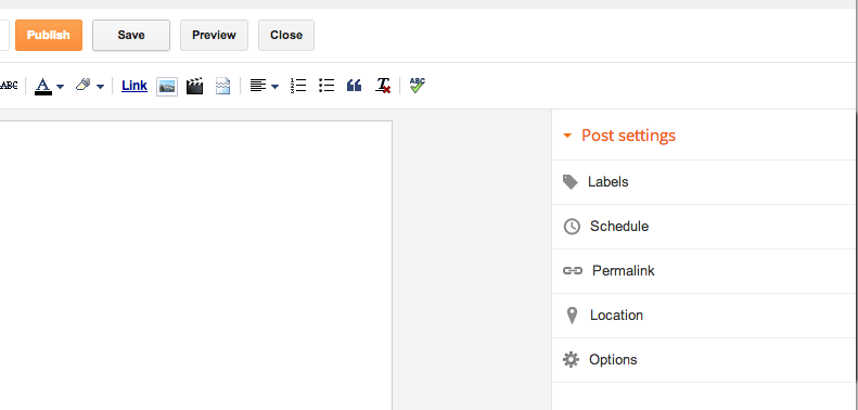
Once you click on the Schedule button, the Schedule section expands. Note that only one section can be expanded at once, unlike the WordPress widget.
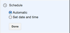
The “Automatic” option really means Now, which should be phrased more clearly. Clicking on the “Set date and time” option brings up a date picker:
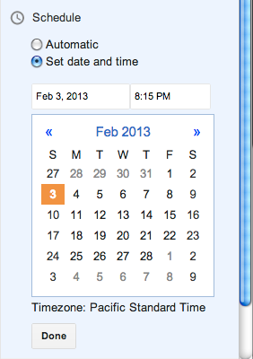
The setting is immediately applied if you click Publish, regardless of whether you have hit Done or not. If you do hit Done, the state is saved and the Scheduling section is collapsed.
There is no Cancel option – if you don’t want to change the date, just put it back to what it was before.
This approach works well. My one complaint is that the Publish text does not change to something akin to Schedule when a date is selected. I had to use trial and error to see what would happen on clicking Publish when a date had been chosen but before the Done button had been pressed – would it publish immediately like WordPress or would it respect the date options? Fortunately it does the most sensible thing and treats the state of the UI controls as the source of truth.
Tumblr
Tumblr takes an approach similar to WordPress but executes it much better. They optimize for the case of immediate publishing, hiding most of the options behind a disclosure button:
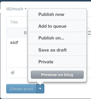
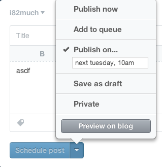
When you click the “Publish on…” menu item, a few things happen. First, there’s a check box next to the item, indicating unequivocally that this is the current selected option. Contrast this with WordPress, which has the confusing case of showing two states in the same area:
Next, notice that the text of the action button immediately changes from “Create post” to “Schedule post”, further cementing the fact that the post will not be immediately created. Finally, note that the button is grayed out and disabled – it cannot be clicked until the menu is dismissed and the changes are implicitly accepted. Once the menu is dismissed, the button is enabled.
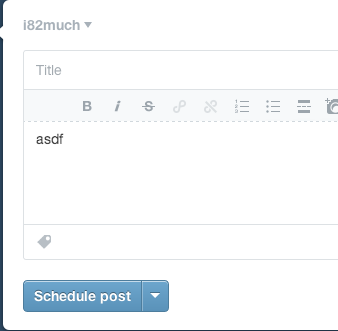
This does everything correctly. It optimizes for the most common use case while hiding complexity. It uses bold visual cues to explain the state of the system. It follows conventions and makes it much less likely that the user will make a Mistake – the mental model of the user is much less likely to be at odds with that of the designer.
Conclusion
Understanding the mental model of the user is crucial for user interface designers. The WordPress designers have chosen to expose strange implementation details which make the act of scheduling a future post extremely confusing and error prone. For each option that can be modified, there is a saved state and the current UI state. Each section must be explicitly saved with ‘OK’ in order for changes to take effect. This leads to confusion in the UI because there is contradictory information being shown – on the one hand dates have been chosen but on the other text says ‘Publish Immediately’. If that isn’t confusing enough, the use of OK/Cancel within subsections of a form is not a standard design pattern. Finally, the OK/Cancel options are small and low contrast and thus are less likely to be seen.
I have shown how Blogger and Tumblr address the task of scheduling posts in two different but superior ways to WordPress. Blogger separates the Publish action from the configuration of scheduling, while at the same time making the current state of those settings take place immediately without explicitly confirming the selection. Because of this simplicity, there is no need for cancel or undo button. Tumblr hides the scheduling details behind a button but makes it absolutely clear through both a large checkbox and an immediate change in button text what will happen when you click it.
The general principles to take away from this case study are:
- Keep things simple
- Follow convention
- Update button text immediately when UI changes are made
In my mistake, there was no real harm done. Since this same confusing interface is present for setting privacy options, I can only hope people trying to post privately do not make the mistake I did.
Stack Overflow profile

