Archive
My two new blogs – Logic Fault and Mobile Last
I’ve started two new blogs to highlight two particular issues that irk me.
The first is Logic Fault, which deals with the sometimes amusing failures of computer algorithms, with an emphasis on recommendation algorithms (think Netflix movie suggestions). You can find that at logicfault.tumblr.com
The second is Mobile Last, which highlights problems I encounter while living a primarily mobile computing lifestyle (in my personal life, I rarely use a laptop or desktop, preferring to use my phone or tablet). That one is at mobilelast.tumblr.com

I want to keep this blog focused on longer form content and analysis, which is why I opted for these two tumblr sites for the more image heavy content. If there is a particular point that is relevant to this blog, particularly as it relates to user interfaces, I very well might post it to both, with the long text appearing here.
Using BeautifulSoup to extract WordPress.com blog post metadata
I want to analyze the popularity of my posts in order to better understand which topics are important to my audience. In my last post about the topic, I showed how to retrieve viewership data about your WordPress.com blog. By itself this data doesn’t tell you much. You can get high level view of the popularity of a blog over time, as well as the traffic for each post. I wanted to go a bit deeper and pull in metadata about the posts themselves, not just their identifiers. This post will show you how to download some raw data and use BeautifulSoup and Python to clean and extract the key metadata.
When faced with a data analysis task, I usually go through the following tasks:
- Find the data – what data do you need? Where can you get it?
- Extract the data – after you have the raw data, extract meaningful signal from the noise
- Clean the data – filter out erroneous or corrupted records
- Analyze the data – extract meaning/insight from the data
This post will detail the first two phases.
Find the data
I’m interested in answering questions such as
- Do posts about Python get more views, or Java?
- Does the time of day I post make a difference?
- Do tags matter?
- How about the length of a post?
With these questions in mind, I can start to formulate what an ideal data source would look like. In protocol buffer syntax, I’d want something like the following:
message Post {
    // The unique identifier of the post
    optional string id = 1;

    // What was the title of the post?
    optional string title = 2;

    // What is the URL to the post?
    optional string url = 3;

    // Publishing date, in YYYY-MM-DD HH:MM format
    optional string publish_date = 4;

    // How was this post categorized?
    repeated string categories = 5;

    // How was the post tagged?
    repeated string tags = 6;
}
The API I uncovered in my last post does not contain any of this post metadata. Fortunately I found another source – the WordPress admin dashboard of posts. Navigate to https://yourblog.wordpress.com/wp-admin/edit.php or click on the Posts category on the left hand side while logged into the administrator dashboard.
Download the raw data

Parsing HTML to extract metadata is not ideal because it is very brittle – if WordPress changes the format of the table containing this data, I would need to rewrite the script that processes it. With no other alternatives, I’m willing to take that chance.
The first step to download the data is to ensure that the table can fit all of your posts; by default it only shows around 10 posts on a page.
Click the “Screen Options” in the upper right corner.

Change the number of posts shown to the max (300) and click Apply. If you have more than 300 posts, you’ll have to repeat the rest of this blog post multiple times.

Next, right click on the table and choose Inspect Element (I assume you’re using Chrome; if you’re not, you can just save the entire website as HTML and pick out the table element manually).
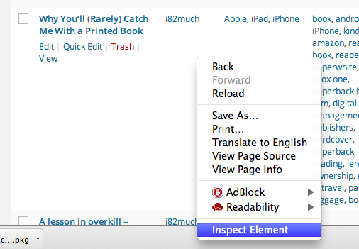
Navigate until you find the <table> element; select it. Right click and choose ‘Copy as HTML’

At this point you have the entire set of metadata about your posts as HTML in your clipboard. Create a new file and paste the data into it. Save it somewhere you can find it later; I called mine “all_posts.html”.
Extract the metadata using BeautifulSoup
We’ll be using BeautifulSoup, an excellent Python library for parsing HTML and XML files. In brief, it allows us to search a hierarchical document for nodes matching certain criteria and extract data from those nodes.
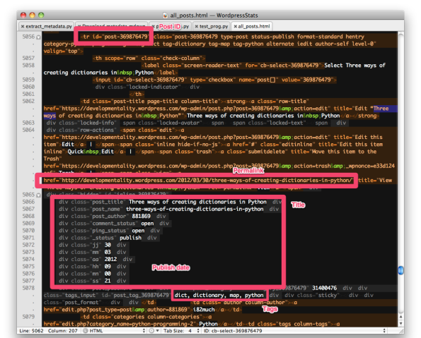
Here is a table row in the HTML with the location of various pieces of metadata illustrated:
After installing the library, create a new Python script and import the library, and create a BeautifulSoup object out of the raw text of the HTML document:
from bs4 import BeautifulSoup

def main():
  soup = BeautifulSoup(open("all_posts.html"))

if __name__ == '__main__':
    main()
The BeautifulSoup object allows us to search for our metadata. Let’s start by finding all of the table rows, since they are the location of the data about each post.
# Extract all of the tr id="post" rows.
# <tr id="post-357234106" class="post-357234106 type-post status-publish format-standard hentry category-photo alternate iedit author-self level-0" valign="top">
trs = soup.find_all('tr')
find_all is a key method in the BeautifulSoup API; it allows you to give some criteria and get back a collection of nodes that match. If none are found, it will be return an empty list. The complement of the find_all function is find, which will return the first such node, or None, if none matches.
Next we loop through the table rows, throwing out the ones that don’t have a post ID and thus don’t represent posts.
for tr in trs:
# Only care about the tr's with ids. These represent the posts.
post_id = tr.get('id')
if post_id is None:
    continue
Here we use the get function of the BeautifulSoup API, which allows you to look up attributes of nodes. If the attribute is not present, get returns None. Just like a normal dictionary in Python, you can use the index operation if you’re sure that the key is present. For instance,
post_id = tr['id']
This will yield a KeyError if the key doesn’t exist. If I’m sure that the node has this attribute, this is a good way to extract the data; if I’m not sure then I’ll use get.
With get, I can also provide a default value to use if the key isn’t present:
post_id = tr.get('id', 'fallback_value')
Note that these nodes don’t behave entirely like standard dictionaries. For instance, it’s standard to check for presence of a key in a dictionary as follows:
if 'key' in the_dict:
This won’t work the way you expect for the nodes.
The id of the node contains some extra cruft that we don’t need – namely a ‘post’ prefix. For instance, <tr id="post-456">. Strip off the extra prefix with standard string functions:
post_id = post_id.replace('post-', '')
Next we look for the anchor node underneath the table row which contains the URL of the post. In the table, this always has the text ‘View’. For instance,
<a href="https://developmentality.wordpress.com/2009/03/10/to-write-clean-code-you-must-first-write-dirty-code-and-then-clean-it/" title="View “To write clean code, you must first write dirty code; and then clean it.”" rel="permalink">View</a>
This is simple in BeautifulSoup:
# Get the published URL
url = tr.find('a', text='View')['href']
Here I use find rather than find_all because I expect exactly one such node. I use ['href'] rather than the get syntax because it’s a simple script and I expect all such nodes to have URLs; it’s a fatal error if they don’t.
There is a large hidden div underneath the post table row containing extra meta data about the post, including the publish date. For instance,
<div class="hidden" id="inline_85408649">
    <div class="post_title">To write clean code, you must first write dirty code; and then clean it.</div>
    <div class="post_name">to-write-clean-code-you-must-first-write-dirty-code-and-then-clean-it</div>
    <div class="post_author">881869</div>
    <div class="comment_status">open</div>
    <div class="ping_status">open</div>
    <div class="_status">publish</div>
    <div class="jj">10</div>
    <div class="mm">03</div>
    <div class="aa">2009</div>
    <div class="hh">23</div>
    <div class="mn">18</div>
    <div class="ss">29</div>
    <div class="post_password"></div><div class="post_category" id="category_85408649">196,3099</div><div class="tags_input" id="post_tag_85408649"></div><div class="sticky"></div><div class="post_format"></div></div>
To find the div, we could do something like the following:
divs = tr.find_all('div')
for div in divs:
    if div.get('class') != 'hidden':
        continue
    # we found it
There’s a better way – we can use the class property directly when we use the find or find_all function. We use it as a keyword argument; note that we have to call it class_ rather than class because class is a reserved keyword in Python.
metadata = tr.find('div', class_='hidden')
Once we have this node, we apply the same technique to pull out the title, year, month, and date of publish. The text attribute returns the text of the node.
metadata = tr.find('div', class_='hidden')
title = metadata.find('div', class_='post_title').text
publish_day = metadata.find('div', class_='jj').text
publish_month = metadata.find('div', class_='mm').text
publish_year = metadata.find('div', class_='aa').text
publish_date = '%s-%s-%s' %(publish_year, publish_month, publish_day)
Finally, we pull out the tags and categories of the post, each of which are found in div elements underneath this root hidden div:
# Find the tags, if they're present
tags = []
tags_div = metadata.find('div', class_='tags_input')
if tags_div:
  tags = tags_div.text.split(', ')

# Find the categories - the node should always be present
categories_td = tr.find('td', class_='column-categories')
categories = [x.text for x in categories_td.find_all('a')]
I use a slightly different technique for the tags than the categories because each category is a separate anchor node, as opposed to the tags which are in the text of one node.
After going through this procedure, we have a lot of information about each post. In order to hold the data about each post, we could create a class with the appropriate fields. For now, the class is a simple holder of variables with no behavior attached to it. As such it’s a great candidate for using the namedtuple functionality of the collections library.
import collections
post_metadata = collections.namedtuple('metadata', ['id', 'publish_date', 'title', 'link', 'categories', 'tags'])
This creates an immutable class with the fields I provided. This saves a bunch of boilerplate and automatically implements correct equality and __str__ functions. For instance,
a = post_metadata(id='48586', publish_date='2010-24-26', title='Some Post', link='http://some/link', categories=[], tags=['programming'])
print a
metadata(id='48586', publish_date='2010-24-26', title='Some Post', link='http://some/link', categories=[], tags=['programming'])
For each post table row, we create one such post_metadata instance with all the attributes filled in.
trs = soup.find_all('tr')
posts = []
for tr in trs:
    #
    data = post_metadata(id=post_id,
                publish_date=publish_date,
                title=title,
                link=url,
                categories=categories,
                tags=tags)
    posts.append(data)
At the end of the script, we now have all the metadata about each post.
metadata(id=u'369876516', publish_date=u'2012-06-09', title=u'Wind Map - a visualization to make Tufte proud', link=u'https://developmentality.wordpress.com/2012/06/09/wind-map-a-visualization-to-make-tufte-proud/', categories=[u'UI'], tags=[u'chart', u'chart junk', u'climate', u'color', u'edward tufte', u'elevation maps', u'hue', u'intensity', u'michael kleber', u'quantitative', u'science', u'tufte', u'UI', u'visualization'])
metadata(id=u'369876270', publish_date=u'2011-04-01', title=u"WordPress Stats April Fool's", link=u'https://developmentality.wordpress.com/2011/04/01/wordpress-stats-april-fools/', categories=[u'Uncategorized'], tags=[u"april fool's", u'wordpress'])
metadata(id=u'369876110', publish_date=u'2011-01-25', title=u'WorkFlowy - free minimalist list webapp', link=u'https://developmentality.wordpress.com/2011/01/25/workflowy-free-minimalist-list-webapp/', categories=[u'UI', u'Uncategorized'], tags=[u'breadcrumb', u'getting things done', u'hierarchy', u'lists', u'nested', u'nodes', u'todo', u'UI', u'webapp', u'workflowy'])
metadata(id=u'80156276', publish_date=u'2009-02-21', title=u'WriteRoom', link=u'https://developmentality.wordpress.com/2009/02/21/writeroom/', categories=[u'link'], tags=[u''])
The last step of today’s post is to output the data as a CSV file. Unfortunately, the standard Python csv module does not handle encoding unicode characters and the table contains unicode. As such we’ll use the UnicodeWriter class that the Python docs include.
columns = ['id', 'publish_date', 'title', 'link', 'categories', 'tags']
post_metadata = collections.namedtuple('metadata', columns)

class UnicodeWriter:
    """
    A CSV writer which will write rows to CSV file "f",
    which is encoded in the given encoding.
    """

    def __init__(self, f, dialect=csv.excel, encoding="utf-8", **kwds):
        # Redirect output to a queue
# snip the definition from http://docs.python.org/2/library/csv.html#csv.writer

writer = UnicodeWriter(sys.stdout)
writer.writerow(columns)
for post in posts:
  row =  [post.id, post.publish_date, post.title, post.link, ','.join(post.categories), ','.join(post.tags)]
  writer.writerow(row)
We then invoke the Python script and redirect the output to our csv file. I’ve uploaded a slightly redacted version of the csv file to Google Docs; you can view it here. The final version of the script is available on github.com.

In my next post I will show how to join this metadata with the view data we accessed via the API in last week’s post in order to gain insight into which types of posts provide value to readers.
Slips vs mistakes – what WordPress gets wrong that Blogger and Tumblr get right
You’ve just finished a blog post and are in the process of scheduling it to go out at a certain time to maximize exposure. You click the confirmation button, only to see your post go live immediately rather than the time you scheduled.
Oops. What went wrong? This happened to me once (and nearly multiple times) due to poor UI design on WordPress.com. Fortunately I only lost a few potential page views; in other cases early releases of information have cost businesses dearly.
Scheduling a post
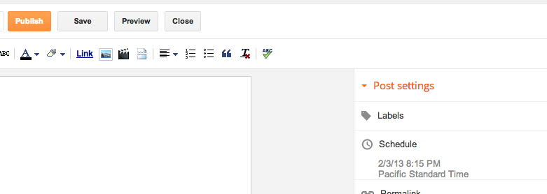
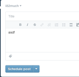
Here is the dialog for publishing on WordPress.
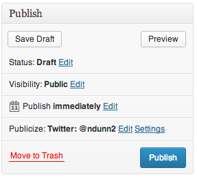
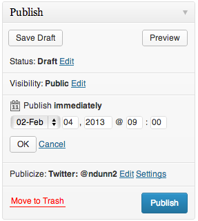
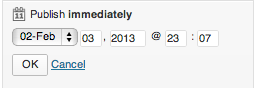
If we click Edit, UI elements reveal themselves for choosing a date and time at which to publish the post.
It was at this point where I pressed the Publish button and my post went live immediately. Do you see what I did wrong?
Slips vs mistakes
From my time in Scott Klemmer’s Human-Computer Interaction (HCI) course, I learned that errors can divided into two classes – slips and mistakes.
A slip is when the user has the correct mental model of the interaction yet makes an error on accident. For instance, if two buttons are close together and you click one rather than the other on accident, that would be a slip. These can often be addressed through things such as making touch targets bigger and adding separation between buttons. From the screenshot, you can see that the Publish button is very large and there’s nothing next to it to accidentally press. (The decision to have the Move to trash button on the same row is rather strange, but it is sufficiently far away that I did not accidentally click on it). This is not the type of error I made.
A mistake stems from the user having the incorrect mental model. That is precisely what happened to me. I did not accidentally press the Publish button; I intentionally pressed it but I had the wrong idea to what would happen. Let’s investigate why.
Convention
What makes interfaces intuitive? Part of it comes from adhering to convention and following the Principle of Least Astonishment. The Wikipedia article sums it up nicely:
In more practical terms, the principle aims to exploit users’ pre-existing knowledge as a way to minimize the learning curve for instance by designing interfaces borrowing heavily from “functionally similar or analogous programs with which your users are likely to be familiar.”
This publishing widget violates conventions in a few ways.
Discarding unsaved user input without warning.
Many programs will warn if you’re about to do something destructive to unsaved input. For instance, if you are half way through a message in Gmail and attempt to close the tab or browser, you will see the popup warning:
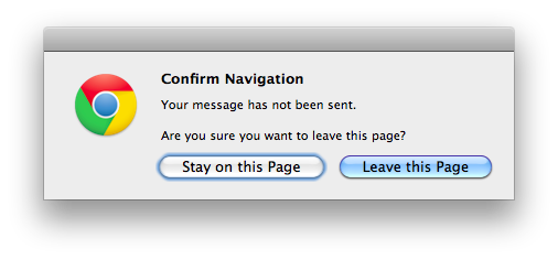
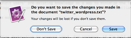
Similarly, all Cocoa applications on Macs will clearly show unsaved state and warn if you try to close a program without saving:

If there are form elements whose state is about to be destroyed by an action, it would make sense to issue a warning about that. This WordPress form does not do the user that courtesy.
Too much state
Most programmers understand that there is state saved on both the server and client. The client will fetch the data from the server and adjust its UI controls to match. Changes to the UI controls don’t automatically get sent to the server; generally there’s some final OK/Cancel action to either accept or discard the changes. Normal users should not need to know this – it should just work. This control exposes too much information unnecessarily. Why would one care what the current server side state is vs what’s in the UI control for each individual section? Why wouldn’t she just set the options the way she likes and hit one button to apply all of the changes?
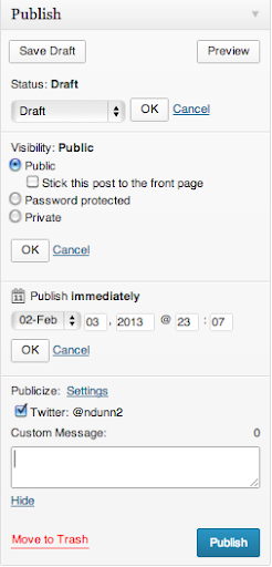
Even if she understands the distinction between client side and server side state (like I do), it is an extremely unfamiliar interface to have to hit OK on a subsection of a form before finally submitting it. I cannot think of one other example that does this. It is convention that hitting the big Confirm button at the end of a form will use whatever information is currently in the form.
In addition to not expecting to have to hit another OK button in order to have my changes applied, this form suffers an additional problem – there is too little contrast between the OK button and the form. Note how the OK button all but disappears with the least amount of blur:

The eye is naturally drawn towards the big blue button in the lower right, which is exactly what I clicked on.
If I had pressed OK, then the Publish button would have changed its text to “Schedule.” Without knowing that that change would occur, I assumed that this control behaved like all others I had used before and so made the mistake.
Alternatives
Let’s look at alternative blogging sites and see how they do things better.
Blogger
Blogger separates the configuration of the publishing options from the publish button itself.
Once you click on the Schedule button, the Schedule section expands. Note that only one section can be expanded at once, unlike the WordPress widget.
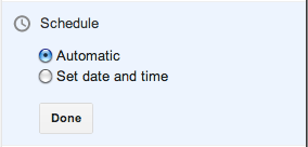
The “Automatic” option really means Now, which should be phrased more clearly. Clicking on the “Set date and time” option brings up a date picker:
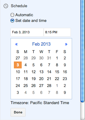
The setting is immediately applied if you click Publish, regardless of whether you have hit Done or not. If you do hit Done, the state is saved and the Scheduling section is collapsed.
There is no Cancel option – if you don’t want to change the date, just put it back to what it was before.
This approach works well. My one complaint is that the Publish text does not change to something akin to Schedule when a date is selected. I had to use trial and error to see what would happen on clicking Publish when a date had been chosen but before the Done button had been pressed – would it publish immediately like WordPress or would it respect the date options? Fortunately it does the most sensible thing and treats the state of the UI controls as the source of truth.
Tumblr
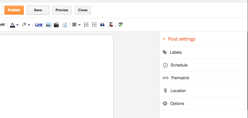
Tumblr takes an approach similar to WordPress but executes it much better. They optimize for the case of immediate publishing, hiding most of the options behind a disclosure button:
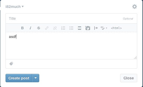
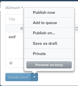
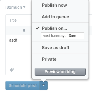
When you click the “Publish on…” menu item, a few things happen. First, there’s a check box next to the item, indicating unequivocally that this is the current selected option. Contrast this with WordPress, which has the confusing case of showing two states in the same area:
Next, notice that the text of the action button immediately changes from “Create post” to “Schedule post”, further cementing the fact that the post will not be immediately created. Finally, note that the button is grayed out and disabled – it cannot be clicked until the menu is dismissed and the changes are implicitly accepted. Once the menu is dismissed, the button is enabled.
This does everything correctly. It optimizes for the most common use case while hiding complexity. It uses bold visual cues to explain the state of the system. It follows conventions and makes it much less likely that the user will make a Mistake – the mental model of the user is much less likely to be at odds with that of the designer.
Conclusion
Understanding the mental model of the user is crucial for user interface designers. The WordPress designers have chosen to expose strange implementation details which make the act of scheduling a future post extremely confusing and error prone. For each option that can be modified, there is a saved state and the current UI state. Each section must be explicitly saved with ‘OK’ in order for changes to take effect. This leads to confusion in the UI because there is contradictory information being shown – on the one hand dates have been chosen but on the other text says ‘Publish Immediately’. If that isn’t confusing enough, the use of OK/Cancel within subsections of a form is not a standard design pattern. Finally, the OK/Cancel options are small and low contrast and thus are less likely to be seen.
I have shown how Blogger and Tumblr address the task of scheduling posts in two different but superior ways to WordPress. Blogger separates the Publish action from the configuration of scheduling, while at the same time making the current state of those settings take place immediately without explicitly confirming the selection. Because of this simplicity, there is no need for cancel or undo button. Tumblr hides the scheduling details behind a button but makes it absolutely clear through both a large checkbox and an immediate change in button text what will happen when you click it.
The general principles to take away from this case study are:
- Keep things simple
- Follow convention
- Update button text immediately when UI changes are made
In my mistake, there was no real harm done. Since this same confusing interface is present for setting privacy options, I can only hope people trying to post privately do not make the mistake I did.
TextMate – Introduction to Language Grammars: How to add source code syntax highlighting embedded in HTML
I’ve blogged about TextMate a few times in the past, and with good reason – it’s an extremely versatile, light weight, powerful text editor for the Mac. One great feature of TextMate is its extreme customizability. Today I’m going to show how to modify one of the TextMate language files in order to add support for Java code within HTML text.
Why is this useful? My workflow for producing blog posts is often to write the post in TextMate using the Markdown markup language, which I then convert to HTML. WordPress has the ability to syntax highlight and provide a nice monospaced version of sourcecode within a post if it’s delimited by <code></code> tags. While the sourcecode comes out fine in the final post, it would be nice to have the syntax highlighting show up from within the Markdown view (i.e. while I am composing a blog post). Let’s get started by looking at how language grammars work in TextMate.
Introduction to Language Grammar Editing
The language support in TextMate is extremely powerful, but it’s a little complicated to get started. In essence, a language defines a series of rules mapping patterns to scopes. For instance, the Java language grammar defines a scope for comments, a scope for control characters, and so on and so forth. The scope is extremely important for many reasons. A few of them are
- The scope determines whether text is spellchecked or not (a top level scope of
sourceis not spell checked; one that istextwill be) - It provides syntax highlighting, as certain scopes are associated with certain colors.
- Snippets can be targeted to only run when within a certain scope. (See this article on Scope selectors for more.) For instance, all the Java snippets are defined as only being active in the
source.javascope.

As an aside, you might wonder why the scope is called source.java as opposed to java.scope. The reason is that some scope selectors can target the more general case (scope), whereas those concerned with java can target the more specific scope (java.scope).
Since someone has already done the hard work of creating a language definition for Java and for creating all of the snippets that support it, we want to leverage this body of work. All we need to do is ensure that text between the java tags is considered to be part of the source.java scope, and everything will just work.
First, let us look at a sample grammar file. Open up the HTML language definition file by going to Bundles -> Bundle Editor -> Edit Languages, or via the shortcut ⌃ ⌥ ⌘L, and choose the HTML option. You’ll be presented with a rather inscrutable, unstyled document to the right. The first thing you should do, and which I found out the hard way, is copy all that text and paste it into a new document.


When you paste the text into the document, the text is unstyled and interpreted as plain text. In order to force TextMate to interpret this as a language grammar, you must click the item in the lower middle that says “Plain Text” and choose “Language Grammar” from the dropdown box. The document should look a lot nicer after this step:


Take a look through the grammar, but don’t get bogged down in the details. The important thing to look at is the list of patterns defined. Here’s just a small section:
    patterns = (
        {   name = 'meta.tag.any.html';
            begin = '(]*>)';
            end = '(>()';
            beginCaptures = {
                1 = { name = 'punctuation.definition.tag.html'; };
                2 = { name = 'entity.name.tag.html'; };
            };
            endCaptures = {
                1 = { name = 'punctuation.definition.tag.html'; };
                2 = { name = 'meta.scope.between-tag-pair.html'; };
                3 = { name = 'entity.name.tag.html'; };
                4 = { name = 'punctuation.definition.tag.html'; };
            };
            patterns = ( { include = '#tag-stuff'; } );
        }
This is the first pattern that will attempt to match. You don’t need to understand all of it, but you should understand that the parentheses in the regular expressions denote capturing groups, which are then referenced in the beginCaptures and endCaptures tags. These assign scopes to the various captured groups. Note too that we can recursively include patterns (via the include = '#tag-stuff' line) which assign scope to various parts of the matched text. This allows us to define a pattern one time and reference it in multiple places, which cuts down on code duplications.
If you look through the HTML grammar, you’ll notice that some embedded code is automatically detected and set to have the matching text use the corresponding language:
ruby = {
    patterns = (
        {   name = 'comment.block.erb';
            begin = '';
            captures = { 0 = { name = 'punctuation.definition.comment.erb'; }; };
        },
Here, any times the <%# %> tag pair is seen, the entire block is captured and assigned to the scope punctuation.definition.comment.erb, which has the effect of distinguishing it from surrounding text. You can see this in action in the following screenshot:

In addition to the fact that the ERB snippet is syntax highlighted, take note of the popup in the screenshot showing “text.html.basic” and “comment.block.erb”. At any point in any TextMate file, you can hit ⌃ ⇧P (Control Shift P) to get the current scope of the cursor. This is extremely useful for debugging why certain elements are not being selected or assigned the scope you think they are.
Adding Java support
While using a TextMate window to edit the grammar is extremely nice, unfortunately you cannot test your changes interactively here. You must copy and paste the contents back to the original grammar window, overwriting the contents, and then press Test. This will reload the grammar and you will see the change reflected in any window using that grammar currently.
With that in mind, let’s add the support for embedding Java within our Markdown blog posts.
The basic pattern is pretty simple:
    {   name = 'source.java';
        comment = 'Use Java grammar';
        begin = '\';
        end = '\[/sourcecode\]';
        patterns = ( { include = 'source.java'; } );
    }</pre>
</div>
I look for the literal string <code></code> to start the pattern, and then the literal string <code>
 to end it.  I have to escape the brackets due to the fact that they have a special meaning within regular expressions ([aeiou] matches any vowel, while \[aeiou\] matches the literal string [aeiou]).
By adding this line to the top of the patterns, it is run before any of the others.  (Remember, we have to actually add it to the HTML grammar within the Bundle Editor, not just the TextMate window with the grammar inside of it).  Once the line is added and you press Test, the Java highlighting beings to work.
Here’s what a snippet of Java embedded in a Markdown blog post looked like without this change:

And after:

Conclusion
Language support in TextMate is a very complex task, and one that cannot be adequately covered in a single post.  I’ve shown here how to add a small snippet to the HTML grammar to allow syntax highlighting of sourcecode delimited by special blocks.  This technique could be expanded to support any number of other programming languages.
The ability to customize TextMate through editing snippets and language grammars makes it extremely powerful.  I hope this has only whetted your appetite to learn more.  If it has, please see the macromates site which has more information about this.
Stack Overflow profile

