Archive
Coursera’s Human-Computer Interaction Class: A triumph of education
I recently took a course on Human-Computer Interaction on Coursera, taught by Scott Klemmer from Stanford University. According to its About page, Coursera is a
social entrepreneurship company that partners with the top universities in the world to offer courses online for anyone to take, for free. We envision a future where the top universities are educating not only thousands of students, but millions. Our technology enables the best professors to teach tens or hundreds of thousands of students.
After having completed this course, I feel that Coursera provides an amazing service. It’s not perfect, but it is far superior to any online courses I’ve taken so far.
Motivation
I have been fascinated with design and making things ‘user friendly’ ever since reading Donald Norman’s The Design of Everyday Things in college. This book details why certain designs fail while others are intuitive and obvious. One of the things that stuck with me is the concept of affordances – buttons ‘afford’ being pressed, dials ‘afford’ being turned, handles ‘afford’ being pulled. To this day, it is one of my biggest pet peeves to find doors that open the wrong way. During a recent trip to Paris, I took pictures of some of the design failures I saw, including this particularly nasty door in the hotel.


It’s the exact same handle on both sides of the door, but it is designed to swing in only one direction. We walked through that door at least 10 times but each and every time we had to think about how to open it; we had to push an interface that was clearly designed to be pulled.
This is a somewhat trivial example, but design can have incredible safety implications as well. A recent article claims that poor design contributed to the 2009 Air France Flight 447 crash:
In the next 40 seconds AF447 fell 3,000 feet, losing more and more speed as the angle of attack increased to 40 degrees. The wings were now like bulldozer blades against the sky. Bonin failed to grasp this fact, and though angle of attack readings are sent to onboard computers, there are no displays in modern jets to convey this critical information to the crews. One of the provisional recommendations of the BEA inquiry has been to challenge this absence.
(Emphasis mine)
When I heard from a coworker that Coursera was offering a course on Human Computer Interaction, I knew I had to take it.
Structure
The course was slated to last 5 weeks though it actually took 6 due to an extension in one of the assignments. Some of the topics included needfinding (determining what actual people need in an interface and how they make do with the status quo), paper prototyping techniques, storyboarding techniques, heuristic evaluation, lab usability studies.
The course had four main components each week:
- lectures
- quizzes
- projects
- peer assessment
Lectures
The lectures were presented as a series of videos broken into approximately ten minute chunks. Each video had the same slides that the professor presented as downloadable attachments. Most of the videos also had subtitles for a few different languages; I heard complaints on the forums that some of the later videos were without subtitles but as I am a native English speaker, it did not affect me.
There were two nice touches I liked in the lectures: embedded quizzes and video playback speed.
In almost every video, there would be a break in the video where an interactive quiz was presented based off of what Professor Klemmer had just presented. It’s a nice pedagogical trick to make sure you’re paying attention and understanding the material.
I found the default pace of the lectures a little slow, but the embedded video player allowed me to speed up the videos. I found the lectures were comfortable to watch at 1.75x speed.
Quizzes
In addition to the mini quizzes embedded in the videos, there were multiple choice quizzes each week based off of the lectures. These quizzes gave instant feedback after submission, which I appreciated. Students could retake the quizzes a few times until they pass; in general I found that the quizzes were easy if you paid attention to the video lectures.
Projects
The course hammered home the point that designers and implementers are the worst people to judge their own work. They have too much knowledge, and their mental model is nothing like that of the ‘average’ user. Furthermore, they are too close to the system to provide an objective evaluation – if they labored weeks on a particular feature, they’re going to inflate its importance, even if the design as a whole would improve without it. The meat of the course, namely the assignments and peer evaluations, were imbued with this idea. We were tasked with building a software prototype and enlisting the help of users to test it and improve its design.
At the start of the course, we were presented with three options for themes our design projects could take on. From the design briefs page:
- Change – “Use the power of new technology to create an application or service that facilitates personal or social behavior change”
- Glance – “Find people and design a personal dashboard tailored to their needs”
- Time – “Redesign the way we experience or interact with time”
I chose the Glance design brief. My inspiration was a hideously complicated board game named Twilight Imperium. It’s a fun turn based conquer-the-galaxy board game, but it has some serious usability issues.

It takes an incredibly long time to learn the rules, and an even longer time to play. The first game I played took literally 16 hours over the course of a few days, and the fastest game I’ve ever completed took 5 hours. Two aspects of the game struck me as particularly frustrating:
- The technology tree (there are 24 technologies grouped into four categories, spread across two massive pages in the instruction manual)
- Combat (each of the ~6 ship types has a different base attack rate, which can be modified by your race, action cards, and political cards in effect)
In every game I’ve played, choosing technologies to buy and the combat bring the game to a screeching halt. I decided that my project would be to build an application of some sort to help make one of these aspects more intuitive and fun.
I designed two storyboards, one for the combat app and one for the tech tree app idea, in order to solidify who the app was for (board gamers who play TI), where it would be used (wherever they play), and the problems it solved (takes too long to pick technologies and/or fight, too much has to be kept in players’ heads)

Next I decided to focus on the technology tree idea and came up with two mockups of divergent designs of this application using the wireframing software Balsamiq. (Longtime readers of this blog might remember that I used Balsamiq to make the illustrations for my post explaining how ListView works in Android). I decided that I wanted to drastically simplify the tree structure as laid out in the instruction manual and instead only display the prerequisites when necessary. (Technology X cannot be purchased until you purchase A AND B or C…).
One of my designs was inspired by the slick UI of Diablo 3 for crafting items:
 .
.
Here’s the Balsamiq wireframe for that design:

The second design I created was a grid layout:

After receiving (and performing) a ‘heuristic evaluation’ of the prototype, I decided to actually implement the grid layout after making a few modifications. In the final few weeks, I implemented an interactive version using d3.js and HTML tables. I am no web designer, and I’m embarrassed by some of the hacks and nonfunctioning pieces of the prototype, but overall I am pleased with how it came out. The final assignment was to perform an honest to goodness usability test with at least three participants. The feedback I received from them will be invaluable for improving the prototype in the coming weeks. You can play with the same version of the prototype that my testers did if you’d like.

Conclusion
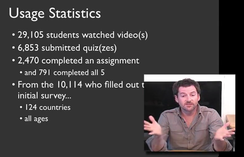
Coursera aims to allow tens or hundreds of thousands of people to be taught in one class, and this course proves that it can be done. According to Professor Klemmer, almost 30,000 students from watched the lecture material, and about 800 completed all of the coursework.
I alluded to it earlier, but the only way that this many students can be graded in a timely manner is through the use of peer evaluations. Before you complete each assignment, you are given exactly the same rubric as your peer assessors will have to grade your work. After the deadline for submission is up, you must go through a training exercise, grading five sample assignments in order to calibrate your scores with that of the professor. After this, you must grade at least five other students’ assignments; failure to do so results in a penalty to your grade. After you have seen these ten examples of other students’ assignments, you grade yourself using that same rubric. While this peer evaluation process was time consuming, it was an invaluable feedback tool, as it allowed me to measure myself relative to my classmates. In a traditional class, it’s rare to ever see others’ completed work, and in some cases it’s even against the honor code. In this online form, it is an absolutely crucial aspect of the course, as it allows the class to scale to a size unimaginable in physical classrooms.
I was extremely satisfied with the course, especially considering this was the first time it was offered through Coursera. Compared to my prior experience of using P2PU’s School of Webcraft to learn JavaScript, the quality of this course was much higher. It was a large time commitment, but I learned a lot and it forced me to actually implement an idea that I’d been kicking around in my head. There were a few hiccups and bugs in the Coursera system, including somewhat vague assignments, but Professor Klemmer noted in his farewell video that they are actively working to resolve these issues. If you get the chance to take this course, I highly recommend it.
Stack Overflow profile

