Archive
Why You’ll (Rarely) Catch Me With a Printed Book

kodumut via Flickr under Creative Commons license
I love books. I love book stores. I worked in a library for four years. But when I read Ali Wunderman’s post entitled Why You’ll Never Catch Me With An E-Reader, I was not convinced. In almost all cases I prefer to buy and read digitally. I’ll discuss her argument, my reasons for preferring digital in most cases, and cases where e-readers and digital books are worse than their paper alternatives.
The two main points of Ms. Wunderman’s argument are:
- She likes the sensations of reading a physical book (touch, smell, sight)
- She values the serendipity of meeting new friends who love the book that she’s reading. Had she used an e-reader, those people would not have been able to see what she was reading, and thus she would have missed out on such encounters
I can’t argue against the first point – it’s a matter of opinion whether or not holding a book feels good. Since e-readers are such a recent invention, I think this argument is rooted in nostalgia more than anything else. It would be interesting to see whether children who grow up with a choice between e-readers and physical books end up with such a physical attachment to books. I do like the touch and smell of books, but it’s not enough to make me buy paperbacks exclusively.
The second point is also subjective. I’ve never had strangers comment on what I’m reading, but I can imagine it would be a fun experience. I am willing to bet that it’s rare. On the other hand, I have heard that some women are more comfortable reading romance novels on their e-readers than physical copies. I don’t really care one way or another; I don’t read books with the intention of showing others what I’m reading.
I have had the experience of bonding with new friends over the contents of our respective bookshelves. If there were no books for us to look at, we would have missed out on some level of connection. While this makes more sense to me than the serendipity argument, I still don’t think this is a reason to stay slavishly attached to dead trees. Once you have established a relationship, it’s easy to converse about books you’ve read, no matter the medium.
Digital preference
The reasons I prefer digital books are price, convenience, ergonomics and lack of physical clutter.
Price
E-books are often cheaper than physical alternatives. This makes sense – the price of publishing and distribution is virtually zero.
Convenience
E-books are incredibly convenient. Let me count the ways:
- Instant gratification – purchase, download, and start reading a book in less than a minute. No need to wait for a book to be shipped to you, or to go to a store
- Instant definitions – no need to break the flow of reading to learn the meaning of a word. Tap and hold on the word to get a quick pop-up definition
- Read free samples of a book before committing to buying it
- Free lending library – check out one free book a month to read

There’s a saying that the best camera is the one you have with you. It’s the same with books. I rarely bring physical books with me, sometimes I have my Kindle Paperwhite, but I always have my phone with me, and that phone has all of my Kindle purchases on it. When I used to use an iPhone it was uncomfortable to read on such a small screen, but I recently switched to a Nexus 5 and have happily consumed entire books on it. The progress I make on one device is instantly synced with all of my other Kindle compatible devices.
Ergonomics
I find it more pleasant to read digitally. I can control how big the font is, I can turn pages one-handed, I can read in the dark with no external illumination, and my devices are light to hold. For example, I bought Cryptonomicon on Kindle to replace a hardcover version partly because I was tired of reading such a bulky book.
Clutter-free
Most importantly, buying digitally frees me from physical clutter. If you’ve ever moved, you know how heavy and unwieldy books are. If you’re traveling, they add weight and bulk to your luggage.
“Rarely”
Unlike Ms. Wunderman, I am not absolute in my preference. I often prefer digital, but I acknowledge that there are some real problems with digital books. These include ownership, longevity, batteries, screens, and the distractions of reading digitally.
Ownership
When you buy digital content, what do you actually own? In 2009, Amazon deleted unauthorized versions of Animal Farm and 1984 straight off of owners’ Kindles. As the article says,
Digital books bought for the Kindle are sent to it over a wireless network. Amazon can also use that network to synchronize electronic books between devices — and apparently to make them vanish.
When you deal with DRM (digital rights management) content, there are very strong restrictions placed on what you can and can’t do with the content. It’s more like a limited license to view the content rather than outright ownership.
For instance, let’s look at lending. With physical books, you can lend your book to whomever you want for as long as you want. With Amazon’s titles, not all publishers allow digital lending in the first place. Of those that do, there are Draconian limitations. From the Amazon Kindle help page:
You can lend a Kindle book to another reader for up to 14 days… A book can only be loaned one time.
Until you can freely loan or give away your digital copies of books, paper wins hands down.
Longevity
Even if you buy DRM-free content, you take the chance that you won’t be able to read that content in a few years or decades. There is a strong precedent of technologies dying and data being trapped on obsolete devices; see Lost Formats for examples. If Amazon goes out of business, what happens to all of the Kindle content you’ve amassed? Hopefully if that were to happen, Amazon would offer a service like Google Takeout to transfer the books to you. (Full disclosure: I work for Google.)

Trav1085 via Wikipedia
The other aspect of longevity is the e-readers themselves. I haven’t had the best of luck with my Kindles so far – I am on my fourth Kindle in about as many years. Three of them died quickly, but as of yet I’ve had no problems in the past 2.5 years with the Paperwhite. It makes me wonder how long these devices last. If you have to buy a new $100 device every 3-5 years, this changes the calculus of whether e-books are more affordable.
Batteries
Digital readers run out of batteries; books don’t. Standalone e-readers typically don’t need charging very often, but phones do. If I were traveling and didn’t have ready access to electricity, this would be a concern. In practice this isn’t a big problem for me.
Screens
Some people prefer the look of a book to an e-reader screen. The e-ink display on the Kindle has improved with each generation, both in resolution, sharpness, and refresh speed. I don’t think there’s an objective winner here. The display on my Nexus 5 is incredibly sharp and I can read it in the dark, just as with the Paperwhite. My only objection to the screen is that it contributes to my spending 90% of my time staring at a glowing rectangle. I mitigate this somewhat by changing to the white text on black background on my phone, and keeping the light low on the Paperwhite.
Distractions
It’s easy to get distracted if you are reading digital books on a multi-purpose device. Reading takes time and concentration. Sometimes it’s hard to stick with that when there’s the allure of games and an infinite expanse of Internet content that’s a few button presses away.
Standalone e-readers offer a more focused reading experience that’s closer to that of reading a book. Since there’s fewer things you can do on it, there’s less temptation to do something other than read. Depending on your level of willpower, this point could be completely moot.
Conclusion
I vividly remember seeing the first clunky version of the Kindle just a few years ago and wondering how its owner could enjoy reading on it. The technology has improved so much since then that I’m a happy convert. While I acknowledge the superiority of physical books in some ways, it often makes sense to buy digital. Doing so avoids physical clutter and is extremely convenient. Most of the technical problems with digital books and e-readers have been solved; the remaining hurdles of consumer-unfriendliness are sociological problems that we can combat. For example, Microsoft changed its restrictive DRM in the Xbox One due to overwhelming negative response. If consumers showed as much passion for their rights to the book publishers and Amazon, perhaps we’d see a loosening of the reins as well.
An interview with William Wilson, self-taught developer of Fret Tester and more
I recently had the opportunity to speak with William Wilson, the man behind Fret Tester, the best guitar fretboard learning application available for iOS, and one of the nicest designed apps I’ve used. I wrote about its great UI features in my previous post, The Best iPhone Guitar Fretboard App: Usability Lessons Learned. I wanted to pick the designer’s brain to see what lessons he could impart about designing usable applications. Here’s what he had to say.
Please tell me a little about your background. Do you design mobile applications for a living or as a hobby?
I’m actually a professional guitarist. I make my living teaching and performing classical and Spanish guitar in San Diego. I’ve always loved programming, starting with Basic, then HyperCard, Java, Flash, and eventually C. I started designing apps for my guitar students as a way to compete with Guitar Hero. I got tired of hearing: “Sorry Mr. Wilson, I didn’t practice, but I played Guitar Hero, does that count?” My first attempts were in Java, and were really awful. I’ve since done about 15 flash games (on my site guitargames.net) and 4 iOS apps. I’ve mostly learned from books and online tutorials. Right now it’s a hobby, but I’d love to do more of it.
As a musician first and foremost, what were the deficiencies you saw in the other published guitar apps and how did you aim to address them?
Traditionally when learning the neck students start with the natural (not sharp and flat) notes. That way they establish landmarks on the neck. I didn’t see this feature being a big part of any app. For me having the iPhone version just display the natural notes made sense (with a button to shift into sharps). Plus it’s tough to fit 12 buttons on the screen without clutter.
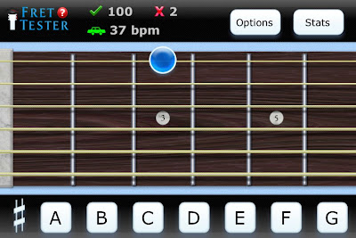
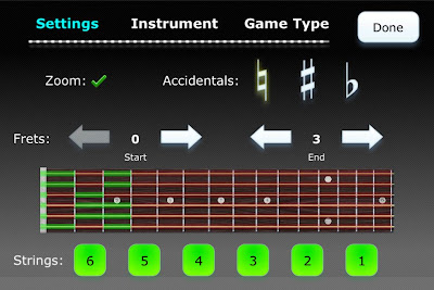
One of the biggest challenges I saw was how to zoom in on the neck. With many of the apps, I tried I lost a sense of where I was on the neck. But if the whole neck was shown it was too small. I decided to have my app zoom to the area that was being tested, but to allow sufficient area on either side so the user had a sense for where they were. Plus I included the option to zoom all the way out should the user prefer it. Related to this, I thought many of the apps lacked reinforcement. When you pushed the correct answer your finger covered it. I added the key style buttons so users could see what note the pushed and thus reinforce the correct answer.

Fret Tester screenshot - note that only the natural keys are shown and that the incorrect answer that was pressed pops up above the obstructing finger
How have your students received your work? Have you seen a measurable improvement in their progress?
I wish I could say that the app was a runaway success with my students… Unfortunately there is a mindset out there that you aren’t practicing unless you have a guitar in your hand. Mental practice is too often neglected, both with note naming and music theory. For the students who have taken my advice and used the app I’ve seen good things. I think separating the mental and physical complexities of the guitar is the way to go.
What advice would you offer to other people who are not programmers by trade but have an idea for a program or application that could simplify or improve some aspect of their everyday life? What resources have you found that were useful in turning your dream into reality?
There are tons of great resources out there. I always recommend http://masters-of-the-void.com/ as a first step. Also Steven Kochan’s Programming in Objective C is great for learning to write for iOS.
Outside “traditional” programming there were three books that greatly influenced me. One is The Non-Designer’s Design Book by Robin Williams, it will help you design a decent looking app. Second is Dave Woolridge’s Business of iPhone App Development, make sure you can sell one or two before you spend a year creating an app. And finally Don’t Make Me Think by Steve Krug, a guide for good UI principles.
Also I would say make sure to beta test often. I had about 8 people test Fret Tester and learned something from everyone. I like to hand someone my phone and say, try this. You’d be amazed at how they struggle to find something you thought was obvious.
You mentioned making sure that you can sell a product before you invest too much time in producing it. How do you recommend that app developers do this? Do you create a bare bones v 0.0 prototype and put it on the app store to gauge interest? Or do you have an alternative technique for market research?
First I look around and see if there are similar apps already out there. If there are a ton, and they’re good, I move on. If there are none I also move on, since there probably isn’t a market for what I’m designing, I want to at least see things that are similar. My goal is to design an app that reaches an already existing need. Not that I’m always successful in it. After reading Woolridge’s book, as well as listening to Seth Godin’s Purple Cow (Audio Book) I’ve improved in this area. I also just talk to people about my idea. If my wife looks at me like I’m nuts (which happens frequently) I try to rethink things.
Are you working on any new projects currently? Or do you have ideas for the next thing you want to work on?
Yes, I’ve been playing around with Adobe’s new Stage 3D and the Starling Framework. It seems promising. I’m hoping to release my first game using it soon. It is called Tab Warrior and is kind of a cross between Fret Tester and Space Invaders. Also, I’m going to try my hand at an Android app this year.
Great to hear. Thank you for taking the time to speak with me. Do you have any parting thoughts for the readers?
One thing I read in Apple’s docs was to only include features in an app that 80% of users will use. That totally changed my approach. If you look at Apple’s success I think its largely the result of keeping things simple and easy to use, and gearing products for the average user. Take the same approach in your apps.
Thank you to Mr. William Wilson for granting me this interview. You can find more about him on his website, WilliamWilson.com. See my Google+ album for more screenshots of Fret Tester.
The Best iPhone Guitar Fretboard App: Usability Lessons Learned
In my search for an app which would help me learn the frets of the guitar, I learned some general lessons on mobile apps and user interface design.
I have been playing guitar for about 3 years but have never mastered the fretboard. Now that I’m paying for lessons, there’s an economic incentive to learn – the faster I can locate notes on the fretboard, the less time and money I waste in my lesson.
At one point I toyed with writing an application myself, but I thought I’d look and see what was out there first before spending my time and effort. I’m glad I did, because there are some excellent offerings. I found five apps that fit the bill: Guitar Trainer HDx, Electric Guitar Fretboard Addict, Fretboard Warrior, Fretronome, and Fret Tester. Here’s the bottom line:
Developers:
- Aesthetics matter
- Design for fat fingers and not a mouse – touch targets must be large and separated
- What’s most convenient for the programmer is not necessarily best for the user
- Focus on the core functionality and and usability rather than extraneous features
- Do not make me accidentally click the ‘buy’ button – I can guarantee I will not complete the transaction
- Think twice about animation
Consumers:
- Don’t be cheap! The difference in quality between free and even a $2 app can be enormous
Guitar anatomy
To those unfamiliar with the guitar anatomy, I’d recommend reading the Wikipedia article. For the purposes of this post, all you have to know is that a real guitar neck is typically about two inches wide, about 25 inches long, has 6 strings, and about 20 frets. By pressing on a fret, you shorten the string and produce a higher note when the string vibrates. Each fret raises the pitch of the note by half a step.
Mastering the fretboard involves learning the correspondence between frets and note names. This can be tested in two directions – given a fret, name the note, and given a note and a string, identifying the corresponding fret.
UI challenges
As previously mentioned, an actual guitar neck is much, much larger than a mobile device’s screen. (By way of reference, my iPhone 4s screen is approximately 3.5 inches diagonal). How then can the app present an interactive fretboard when the strings are so close together on the physical screen?
Of the apps I tested, they took two approaches. Either they displayed the entire fretboard (usually only 12 frets, since that’s all you need to represent a full octave), or they displayed a zoomed in view of a few frets. Here are some of the pros and cons of each approach:
Global view (zoomed out)
Pros
- Better simulates what you see while actually playing guitar
- Provides global picture – easier to see relationship between notes and where frets fall in absolute and relative terms
Cons
- Frets and strings can be very close together and hard to distinguish
Zoomed in view (partial fretboard)
Pros
- Able to provide much more separation between strings, providing larger touch targets
Cons
- Hard to get a sense of where notes are relative to one another
- Does not simulate reality, unless you play guitar with blinders on with your nose an inch or two from the fretboard
The apps
Now that we’re acquainted with the fundamental UI challenge of a fretboard teaching/testing app, let us examine the competition.
Guitar Trainer HDx
I tried the free version; a paid version is available for $2.99.
This app takes the zoomed in approach to the fretboard, only showing approximately 4 frets at a time. While this gives a great amount of separation between the strings, it feels wrong. It uses the familiar inertial scroll pane that most iPhone apps do, but it seems ill-suited to the task. The view is so zoomed in that it’s very hard to get any sense of where you are in absolute terms.
An additional problem is that the app presents far too much information by default. The names of each note are displayed in a large font, as well as the number of each fret. On a real guitar, there are dots which indicate certain fret landmarks (3, 5, 7, 9, 12, 15, 17, on my guitar), and these crutches that the game provides will not force you to learn them. You can turn them off in the settings, but due to the cramped, zoomed in nature, it is hard to figure out where you are.
In training mode, the app presents you with random notes and you must identify them by name. The app supports both landscape and portrait modes, but there is something very off in its determination of your orientation. When the view switches, the fretboard stays static; the only thing that moves is the buttons at the bottom of the screen with the names of the potential notes. Often you will be holding it in one orientation and the notes suddenly shift 180 degrees as if it thinks you are holding the phone upside down. It’s supremely annoying.
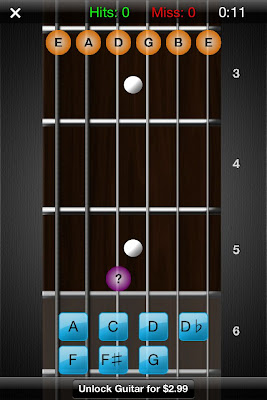
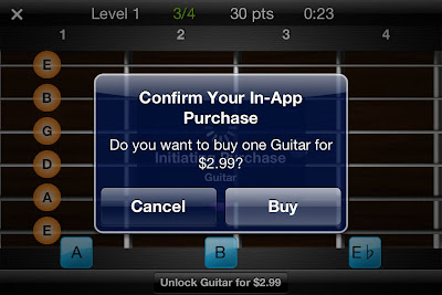
Don’t even bother trying to play the game in portrait/vertical mode; the buttons are so small and close together that you will often hit the wrong one. Even more annoying is the “Unlock Guitar for $2.99” button that resides approximately 10 pixels beneath the bottom row of buttons. I cannot tell you how many times I accidentally hit the button while trying to test it out.
There is a training mode and then a testing/game mode in which you must identify a certain number of notes in the allotted amount of time. Throughout these modes, the app tracks the number of correct notes, misses, hit percentage, and total time. Additionally, there is an option to view the portion of the fretboard that you’ve mastered. This is one of the best parts of the app.
Aside from the previous annoyances, the game feels extremely sluggish. This is due in large part to the extraneous animation that occurs each and every time you identify a note. It’s as if you are watching someone who is learning PowerPoint for the first time and adds flying transitions to every slide – it might look OK the first time, but waiting a good 2 seconds each and every time gets old fast.
Finally, the game gives you one chance to identify the note. If you misidentify it (most likely due to the problems of the button size/placement I mentioned), it immediately flags it wrong and moves on. This is problematic as a pedagogical device because it does not give you a chance to correct your mistake before moving on. As you will see later, other apps handle this better.
All in all I cannot recommend this app, even for free.
Rating: 2 stars
Electric Guitar Fretboard Addict v1.4.3
Products by Michael Rylee
App store
Once again, I tested the free version; a paid version is available for $4.99
This app provides a photograph of a guitar neck rather than the vector graphics of some other apps. This is problematic because the photo suffers from perspective distortion – the bottom of the fretboard is much wider than the top of the fretboard, meaning the touch targets for the top notes are impossibly close together. The tab bar at the bottom of the screen wastes additional screen real estate, as does the large (approximately 1/4 of the screen width) bar on the right indicating which note to touch.
This app aims to teach you the fretboard in a much more regimented way. There are a total of 133 Rounds (approximately 30 are available in the free version) moving down the fretboard. Sometimes a note is presented and you must choose which string on the given fret matches it; sometimes a fret is highlighted and you must pick from the available notes on the right side of the screen. In a third mode, the note is represented not as its name but by its position on the musical staff.
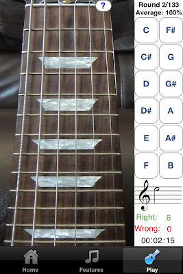
The touch targets for identifying the note names are fairly large, but identifying which string corresponds to the given note is a harder feat, given the small amount of separation between the touch areas.
While I prefer the zoomed out view that this app provides, in general, the aesthetics are lacking. The logo looks like bad clipart and the app is littered with tiny, illegible thumbnails advertising his other products. The developer’s tagline says “Now you can practice anywhere you have a Mac, iPhone, iPod Touch, iPad, PC, or Windows Mobile Device!”, and unfortunately it shows. The look and feel is just not up to par with standard iOS apps.
I admire the different ways in which the app tests you (note -> fret, fret -> note, note on staff -> fret), though I want less of a methodical walk through the fretboard and more of a drill to test my knowledge. The paid version is very highly rated but I did not get hooked on the free version enough to warrant a purchase.
Rating: 3 stars
Fretboard Warrior
Fretboard Warrior is an extremely minimalist app for testing your knowledge of the fretboard. You pick a duration of either 1, 2, 5, or 10 minutes and try to identify as many note names for the given fret as possible.
As I prefer, the app uses a zoomed out view of the fretboard to display the first twelve frets. Furthermore, since you are not touching the individual notes themselves, the fact that the strings are close together is not an issue. The issue comes from the fact that the buttons at the bottom of the screen are absolutely tiny. There’s really no reason the buttons need to be so small – there is an enormous amount of wasted vertical space on either side of the guitar neck, as well as on the top. If more vertical space were taken up, then the accidental notes could be moved out of line from the rest of the natural keys to provide more separation among the notes.
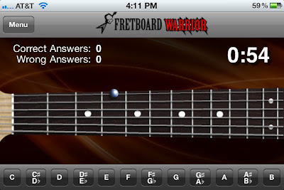
While I do appreciate minimalism, a little more functionality would be nice. For instance, it would be useful to be able to limit the range of frets and/or strings that are tested for students that are just starting out. If you already know the whole fretboard and are looking for a way to drill yourself and speed up your ability to identify the notes, then this app might do you well.
Rating: 3 stars
Fretronome
Free
Ahhh. Using Fretronome after some of these other products is like night and day – this is how an iOS app should look.
It provides a beautiful vector based graphic of the neck, which is slightly distorted in order to provide better separation between the strings. Unlike Fretboard Warrior, this allows you to restrict your practice to a string of your choice (though not a range of frets).
I really admire the developer of Fretronome for doing something ballsy and completely different than all the other developers. Rather than providing a list of buttons (with all the problems previously mentioned), he provides a single enormous button for revealing the hidden note name. Another tap of the button hides the note and queues up a new note to identify.
Since you never indicate the note, the app cannot automatically keep track of whether you got the note right or wrong. Nevertheless, it provides a great flashcard approach to learning the fretboard.
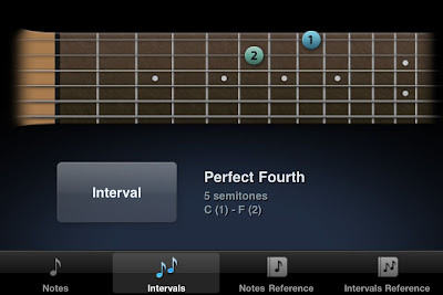
The app features an Intervals mode in which two frets are indicated and you must identify (again, in your head) what the musical interval is between them. It’s a great feature that I’m sure I will use more after I learn the rudiments of the fretboard.
Rating: 4 stars
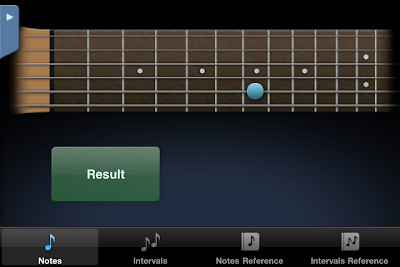
Fret Tester
$1.99 App store link
I decided to try a paid app to see how it differs from these free ones. I’m glad I did – I use it exclusively now.
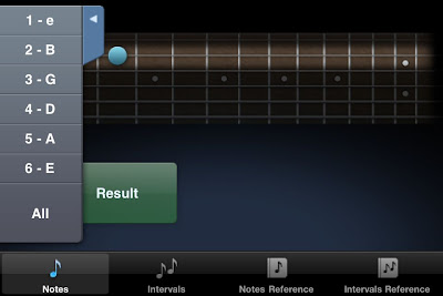
This app gives a horizontal view of the fretboard, defaulting to a zoomed in view of 6 of the frets, but optionally zooming out to show 12. Unlike Guitar Trainer HDx, the fretboard does not scroll in the zoomed in view; rather only the region of interest is displayed. Like Fretronome, the fretboard is rendered as an idealized graphical form rather than as a photograph. This ensures that there is no distortion of the fretboard. The aesthetics are excellent.
There are four modes – Name Note, Find Note, Notation, and Notes on Staff.
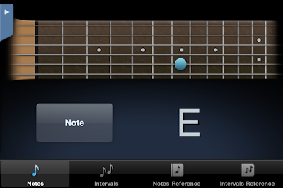
Name Note
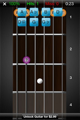
Name Note is the standard mode which all of these apps provide. Unlike Fretboard Warrior, it does not try to cram twelve notes into the bottom of the screen. Instead, the names of the 7 natural notes are displayed as large touch targets on the bottom of the screen (A, B, C, D, E, F, G). The accidentals (sharps and flats) are hidden and only revealed when the sharp key is pressed. When in that mode, the A turns to A#, C to C#, and so on and so forth.
This is a great design choice for two reasons. First, the natural notes are more common (7 out of 12 possible notes) so it makes sense that they should be more readily accessible. Second, by restricting the choices to 7 as opposed to 12, as many of the other apps do, the touch targets can be much bigger with more separation between them. This makes a huge difference in the usability of the app, as you will rarely, if ever, click the wrong button on accident.
When you misidentify a note twice in a row, the correct answer will be highlighted green, but you must still make the correct choice before the next note is displayed. This is a good feature, as you must always get the right answer to move on, even if the app helps. In contrast, and as discussed earlier, Guitar Trainer HDx immediately flags your answer as “WRONG!” and automatically moves you to the next note.
Unlike some of the other apps, there is no timed mode. I don’t mind this, as I find a ticking clock stressful and distracting. It does give you a measure of your speed by displaying a ‘beats per minute’ value (the rate at which you are identifying notes/frets), as well as a graphical representation (turtle, hare, car, rocket ship). I like the simplicity of the icons and prefer this way of measuring speed to a time trial.
Playing with this app provides a much more fluid experience and helps me enter the flow state much more than the others. I struggled to determine why that was until I noticed two main differences.
The first is that there is no extraneous animation between the identification of one note and the display of the next. For instance, Guitar Trainer HDx hides all the other answers after you’ve made the correct choice, and displays a huge CORRECT! on the screen which rotates around and leaves the screen. I’m all for positive reinforcement, but I don’t need that much, and I don’t need the second or two pause between the identification of one note and the display of the next. This app moves on to the next note with no hesitation, allowing you to drill yourself as fast as you can think.
The second difference is more technical. To explain it, first some background. What we think of as a mouse click (or tap on the mobile world) is really two separate actions – the mouse button is pressed and subsequently released. In most cases the time between these two actions is so tiny that we can treat the two as the same. The distinction between the press and release is important. Why? Try this test – press and hold the mouse over the following link. Now drag the mouse out of the url and release the mouse. Note that you have effectively canceled the navigation. The same is true of most button implementations – the action does not occur until the mouse is released within the button area. This pattern of having actions occur on mouse release is, in general, a great thing – it allows you to rethink your decision before commiting to it.
Instead of doing what is standard, Fret Tester uses the press on the note button, rather than release, to trigger the action. This means that by the time your finger has come off the screen the hit has already been registered and the next note displayed. This contributes to the feeling of speed. Since there are no real negative consequences for making a wrong note choice (it’s not like you’re going to delete an important document, for instance), the extra speed increase is worth the lack of a safety net. It’s a very subtle touch but it makes a big difference.
In terms of features, this mode goes beyond all the others I tried. The options allow you to focus on the areas you need to improve. For instance, you can restrict the range of the fretboard tested (e.g. frets 3-6) as well as the specific string or strings (the B string is a weak area for me personally). You can also choose whether to test accidentals (sharps or flats) or only the natural notes. I personally choose to play on the natural note mode since it works so well with the seven large notes displayed at the bottom of the screen. I find this combination of options extremely appealing as it allows you to focus just on the weak areas rather than wasting your time with what you have already mastered.
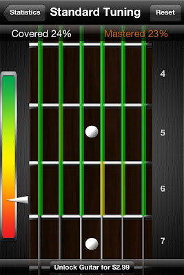
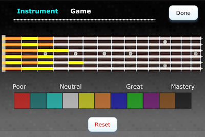
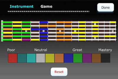
You can track your progress by means of a graphical representation of your mastery of each fret, accessible via the Stats menu. I have one minor complaint about this display – the level of mastery is mapped to seemingly arbitrary colors. In my opinion, this should have been a linear interpolation between two colors (e.g. white to black) in order to more easily determine which frets were strongest and which were weakest, without having to continually consult the color code. Nevertheless, it is very compelling to track your progress and try to turn all of the frets black.
Other modes
Find Note
Find Note is a rarer mode; only Electric Guitar Fretboard Addict had this feature. In this mode, you are given a note name and four consecutive dots on a string and must choose the correct fret. The touch targets are big and well-spaced in the zoomed in mode. When zoomed out, it’s ocasionally hard to select the correct fret, but the fact that the choices are limited to one string (rather than adjacent strings) obviates most of the annoyance.
Notation
In notation, a note on the staff appears and you must touch the corresponding fret. I haven’t used this mode much yet, but it’s a nice bonus.
Notes on Staff
Similar to Notation, this mode has you name a note on the staff rather than find its place on the fretboard. I have many years of experience reading sheet music, but it’s also been awhile, so this is a nice refresher.
Conclusion
This app is just about perfect. The core Find Note experience is by far the best out of all the apps I tried, in large part due to the care put into the user interface concerns. Even if you never touch the other modes and features (e.g. bass, mandolin, 5 string bass, left handed mode, alternate tunings), $2 is a steal for the core Find Notes drill.
Rating: 4.5 stars
Conclusion
This post explored five different applications’ approaches to the user interface challenge of representing a large physical guitar fretboard on a small mobile screen. We saw that certain applications did not pay enough attention to the separation needed between adjacent touch targets, or to the size of each target. We also saw how the ubiquitous scroll pane works well for standard apps but does not work well for a task where global positioning and spatial relationships are important.
Fret Tester was the clear winner of the contest, due to its great aesthetics, usability, and design. Its modes eschewed flash and animation for a fast, accurate, responsive testing environment. There is no ticking clock to exert pressure on you, but there are clear visual indications of progress (both in terms of speed, accuracy, and overall progression on the fretboard).
While this post focused on guitar fretboard applications, many of these user interface lessons can be applied to any mobile endeavor.
Comparison chart
Please see the Google doc summarizing the various featured of the tested products.
Make your Mac more like an iPhone: How to reduce distractions and improve focus
While our desktop computers excel at multitasking due to their multiple cores, the human mind fares much worse. There have been multiple studies showing that multitasking can impair productivity. Often the reasoning is that the brain requires time to adjust between different tasks, due to the switch in context. An analogy for this would be driving on a highway. You’re going to cover a lot more ground in the same amount of time if you can keep a constant speed (focusing on one task) rather than having to constantly take exits and switch to new roads (tasks). While those who multitask frequently might think that switching tasks bears no greater cost to them than switching lanes on the highway, the studies suggest that the cost in focus and time in switching to the new task is more akin to having to take that offramp, find a new highway, and then get back up to speed.
But enough about metaphors and science. I am not a cognitive scientist so I’ll leave that up to the people who do it best. I can only speak for myself, and I find that it’s supremely tempting to pick away at pieces of problems rather than to focus on one thing and make significant progress in that regard. I also know that I am objectively less productive if I constantly am switching tasks.
It is for that reason that I’ve assembled a set of tools that allow me to have a stronger single-minded focus while working on a computer. While there are systems such as Getting Things Done and the Pomodoro Technique which address the human aspect, I’m going to be focusing more on technological solutions with respect to working on an Apple computer. While many criticize the iPhone and iPad for their limited multitasking support, I think having full-screen applications and focusing on one thing at a time is very beneficial. With that thought in mind, the rest of this post will show various ways to make the Mac less suitable for multitasking and closer to the iPhone/iPad model of computing.
Hide the dock
Why
Gain more desktop real estate. Eliminate the visual clutter at bottom of the screen.
How:
Right click on a portion of the dock which does not have an icon, e.g. on the portion where the dock can be resized.
Reduce use of tabbed browsing
Why
I love the ability to open multiple webpages in a single browser. It can be supremely useful when you are researching and need to have multiple pages open to reference. Unfortunately it can also lead to shallow reading and a mild form of A.D.D. wherein the user (i.e. me) keeps opening new links with the intention of reading them later. There is seemingly no cost to opening a link in a new tab, but it does exert a cost – it makes it harder to find the tabs that are actually relevant, and it also uses more system memory.
How
There is a discussion on the Firefox feature request group to limit the number of tabs that one can open at a time, for reasons similar to what I have presented above. The best solution given is to install a TabCounter extension in FireFox which shows how many tabs you have open. It still requires you to monitor the number and prune the number of tabs when things get too bogged down, but it’s better than nothing.
For those using Chrome, there is a Tabs Counter plugin which performs the same task.
Hide your desktop icons
Why
My desktop inevitably is the dumping place for miscellaneous junk. I’d rather just keep it out of sight and search with a program than keep it organized and visually scan through them for what I’m looking for. Computers are a lot better at search than humans; let’s take advantage of that. The icons on the desktop do nothing more than distract me.
How
Camouflage hides desktop icons
+ allows you to double click on the desktop to have a finder window popup for the desktop
+ allows you to change the desktop background
+ free
Desktopple
+ also has option of dimming the menu bar
– paid ($17)
I use Camouflage on both my home and work Mac. I was happy to see that Windows 7 allows you to hide the desktop icons without installing an additional program.
Dim your menu
Why
Eliminate distractions by de-emphasizing the elements on the screen that are not important. For the time you are not actively attending to the menu, make it less visually important.
MenuShade
– doesn’t seem to work in 10.5
MenuEclipse
+ Works fine in 10.5
– abrupt jump between dimmed and not dimmed – the menu dimming in DeskTopple is more gradual / less harsh
Standard brightness
Dimmed
I use MenuEclipse on both my work and home computer. It’s not a life changing application but it does what it sets out to do.
Dim your unused applications
Why
When you have multiple applications jockeying for your attention, you necessarily lose focus
There are some obvious exceptions to this; for instance it is often extremely convenient to have both a calendar program and e-mail program open side by side when scheduling things, or having a web browser next to your programming environment for web search results. There are other times in which such extra programs are a distraction; in this case having a single program as the focal point can allow you to focus.
How
Doodim
+ free
– does not interact correctly with Quicksilver/Alfred quick launchers
– noticeable lag when switching between windows
– no way of specifying the brightness
– seemingly not in active development
http://www.lifeclever.com/doodim-menushade-eliminate-distractions-on-your-mac/
– Ugly icon that takes up a huge amount of space
Think
+ Free
+ Much more polished than DooDim
+ Allows you to customize how dim the background gets
+ System settings stay bright
+ Works with Quicksilver/Alfred
O different interface than Doodim – you have to explicitly choose a new window to focus on via an interface similar to the standard task switcher, rather than being able to shift the focused window by clicking on other windows.
– Does not work with multiple spaces
I use think on a daily basis; in fact I am writing this article with all but my FireFox window dimmed out. The higher your screen resolution, the more useful this program is. When working on a 13″ screen I don’t often tile my windows too much. But when you have a 30″ monitor or something similar, you can end up with many programs onscreen simultaneously. And you might not want to put the program you’re working on full screen, especially if it’s just a text editor. That’s when being able to have your programs the size you want and still be able to dim all the rest can be especially useful
Eliminate interruptions
The final piece in reducing distractions and improving single-minded focus is to remove the interruptions that our installed programs produce.
Turn off Growl notifications
If you’re unfamiliar with Growl, it’s a program which ” lets Mac OS X applications unintrusively tell you when things happen. ” While it is a lot less intrusive than a traditional modal popup window, it still can be distracting. The first thing you should do is close the programs that are creating the popups in the first place, but you might want the program to run, just not keep interrupting you.
I personally haven’t taken this step, but you can remove Growl if you find it too distracting. Instructions are here.
Turn off e-mail alerts
E-mail clients on the Mac seem to think every e-mail that comes in is a matter of life and death, and that you absolutely must see every e-mail the instant it arrives. Those of us who work in an office know that this is far from the truth. As Merlin Mann writes:
Email is such a funny thing. People hand you these single little messages that are no heavier than a river pebble. But it doesn’t take long until you have acquired a pile of pebbles that’s taller than you and heavier than you could ever hope to move, even if you wanted to do it over a few dozen trips. But for the person who took the time to hand you their pebble, it seems outrageous that you can’t handle that one tiny thing. “What ‘pile’? It’s just a fucking pebble!”
While dealing with e-mail is a whole different issue, the least we can do is make sure that each pebble falls silently into the inbox rather than calling attention to itself.
Mail.app
Mail -> Preferences -> New mail sound: None
Entourage
How to turn off e-mail notifications in Entourage
Short version:
Entourage -> Preferences -> General Preferences -> Notification ->
Uncheck Display Alert, Bounce Icon, Bring Application to Front, and New Mail Sound
Thunderbird
Instructions on turning off e-mail notifications in Thunderbird
Conclusion:
This post was started long before Apple’s announcement of its new operating system, Lion, but it was not surprising to me that Apple is going to make OSX work more like iOS, with the addition of full screen applications and an app store. I don’t want the Mac to become exactly like a giant iPhone or iPad, and I certainly wouldn’t want every application to be full screen. However, there are times when I need to focus, and by making the computer less capable, it makes me more.
Stanza e-book app – how to fix the screen brightness
Stanza is a great free e-book reader for the iPhone or iPad. One thing I noticed while using it was that the screen would be very dim from time to time. Thinking there was a problem with the light sensor, I’d try all sorts of things to try to get the screen brightness to fix itself. Other apps on the phone didn’t have this problem, so I figured I must have changed some setting. I looked in the settings of the app but there was nothing indicating how to change the brightness.
Highest brightness
Lowest brightness
Finally I discovered by accident that dragging your finger up and down the screen increases and decreases the brightness. So if your Stanza app reading experience is hampered by a dim screen, try dragging your finger from the bottom to the top.
Hopefully this helps someone similarly confused.
iOS 4 – iPod controls discovery
Fortunately it hasn’t completely. When the phone is locked, a double press on the home button brings up the standard iPod control screen I find so useful:
On the other hand, when you’re in a standard app and double tap the home screen you’ll see the bar pop up at the bottom of the screen with the apps you can switch between. I stumbled upon the fact that you can swipe this bar of icons over towards the left and the iPod controls are visible without having to explicitly hop out of your app and into the iPod controls.
While it’s not two taps and a swipe to get to the controls as opposed to just two taps, this is a very small price to pay for the multitasking of iPhone OS 4. Hopefully this is useful to someone who hasn’t discovered this already.
Stack Overflow profile

